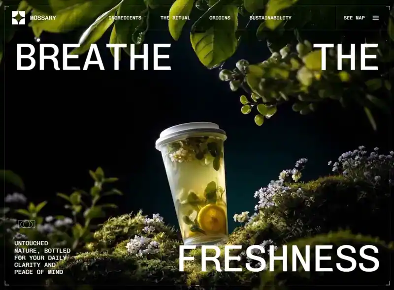
类型:Site模板 · 分类:Wellness · 源码:会员可见

Build a **single full-screen hero section** for a brand called **Mossary** (nature/wellness water brand) as a **Vite + React 18 + TypeScript + Tailwind CSS 3** project. Output must be pixel-faithful to the spec below — **especially the spacing system in §5**. Do not add sections, do not add extra copy, do not substitute the asset URLs.


> ⚠️ **CRITICAL — READ BEFORE BUILDING**: This is NOT an edge-to-edge layout. There is a visible gutter between the browser viewport and a hairline-bordered frame, and a second layer of padding between that frame and the text inside it. Headline words (`BREATHE`, `THE`, `FRESHNESS`), the description paragraph, and the nav/logo must **never touch the viewport edge or the frame's inner edge**. If your output has text flush against the screen edge with no visible border box around the whole composition, it is wrong — go back to §5 and apply the exact pixel values.


## 0. Project scaffolding


- Vite + React + TypeScript, `"type": "module"`.

- Dependencies: `react@^18.3.1`, `react-dom@^18.3.1`. Dev: `tailwindcss@^3.4.1`, `postcss`, `autoprefixer`, `@vitejs/plugin-react`, `typescript`.

- `vite.config.ts` — React plugin, plus a path alias `@` → `./src`:

  ```ts

  resolve: { alias: { '@': fileURLToPath(new URL('./src', import.meta.url)) } }

  ```

- File layout: `src/main.tsx` → `src/App.tsx` → `src/components/Hero.tsx`. `App.tsx` renders `<Hero />` and nothing else.

- `src/index.css`:

  ```css

  @tailwind base;

  @tailwind components;

  @tailwind utilities;


  * { margin: 0; padding: 0; box-sizing: border-box; }

  html, body { overflow-x: hidden; }

  ```


## 1. Typography


- Font family: **Chivo Mono** (Google Fonts), weights `300;400;500;600;700`.

- Load in `index.html` `<head>` with preconnects:

  ```html

  <link rel="preconnect" href="https://fonts.googleapis.com" />

  <link rel="preconnect" href="https://fonts.gstatic.com" crossorigin />

  <link href="https://fonts.googleapis.com/css2?family=Chivo+Mono:wght@300;400;500;600;700&display=swap" rel="stylesheet" />

  ```

- `tailwind.config.js` overrides the mono stack so `font-mono` resolves to Chivo Mono:

  ```js

  theme: { extend: { fontFamily: { mono: ['"Chivo Mono"', 'monospace'] } } }

  ```

- Page `<title>`: `Mossary Hero Section`.

- The entire section carries `font-mono` — **every** piece of text on the page is Chivo Mono.


## 2. Color tokens (exact)


| Token | Value | Used for |

|---|---|---|

| Section background | `#010101` | behind the video |

| Label pill text | `#07141B` | text inside the white callout pills |

| White | `#FFFFFF` | all headline/nav text, brackets, SVG strokes, pill background |

| `white/10` | rgba(255,255,255,0.1) | frame border, nav dividers |

| `white/20` | | close-button ring |

| `white/40` | | mobile-menu link underline |

| `white/50` | | mobile-menu footer wordmark |

| `black/90` | | mobile-menu scrim (with `backdrop-blur-md`) |


## 3. Background video (exact URL — do not change)


```

https://d8j0ntlcm91z4.cloudfront.net/user_38xzZboKViGWJOttwIXH07lWA1P/hf_20260813_093202_0dff6f4a-4eb9-4252-8738-7214941c4b1a.mp4

```


Rendered as:

```jsx

<video

  ref={videoRef}

  className="absolute inset-0 h-full w-full object-cover"

  src="https://d8j0ntlcm91z4.cloudfront.net/user_38xzZboKViGWJOttwIXH07lWA1P/hf_20260813_093202_0dff6f4a-4eb9-4252-8738-7214941c4b1a.mp4"

  autoPlay

  loop

  muted

  playsInline

/>

```

`playsInline` + `muted` are required for iOS autoplay. No poster, no overlay tint, no `<source>` children.


## 4. Root structure


```

<section>                       relative h-[100dvh] w-full overflow-hidden bg-[#010101] font-mono

  <video>                       absolute inset-0 h-full w-full object-cover

  <div GUTTER>                  relative z-10 mx-auto flex h-full flex-col p-2 sm:p-3 md:p-4 lg:p-5   ← layer A padding, see §5

    <div FRAME>                 relative flex flex-1 flex-col border border-white/10

      4 corner brackets + 2 center ticks

      <Nav />                   (header + mobile menu)

      <div CONTENT>              relative flex flex-1 flex-col justify-between p-3 sm:p-4 md:p-6 lg:p-8  ← layer B padding, see §5

        top row:    "Breathe" (left)  ·  "the" (right)

        <Labels />              absolutely positioned, video-driven

        bottom row: <BottomDescription /> (left)  ·  "freshness" (right)

```


Use `h-[100dvh]` (dynamic viewport height), **not** `h-screen` — this is what keeps mobile browser chrome from clipping the frame.


## 5. SPACING BLUEPRINT ⭐ (exact pixel values — this is what generators usually get wrong)


There are **two nested padding layers**, plus a set of smaller internal paddings/gaps inside individual components. Nothing in this layout is flush against an edge. Use these exact numbers — don't approximate.


### Box-model diagram


```

┌─ viewport ──────────────────────────────────────────────────┐

│  ← Layer A: GUTTER (8/12/16/20px, see table) →               │

│  ┌─ FRAME (1px solid white/10 border) ─────────────────────┐ │

│  │ ┌─ header row (border-b white/10) ──────────────────┐   │ │

│  │ │ [12-24px pad] LOGO+WORDMARK | NAV | SEEMAP+BURGER  │   │ │

│  │ └─────────────────────────────────────────────────────┘   │ │

│  │  ← Layer B: CONTENT PAD (12/16/24/32px, see table) →      │ │

│  │  BREATHE                                          THE     │ │

│  │                                                            │ │

│  │  [atom]                                                    │ │

│  │  description text                          FRESHNESS       │ │

│  └────────────────────────────────────────────────────────┘ │

└────────────────────────────────────────────────────────────┘

```


The gutter (Layer A) is the space between the actual browser edge and the visible hairline frame. The content padding (Layer B) is a **separate, second** inset between the frame's border and the headline text / description / labels. Both exist at the same time — they stack, they do not replace each other.


### Table 1 — Layer A: outer gutter (`p-2 sm:p-3 md:p-4 lg:p-5`, all 4 sides)


| Breakpoint | Width | Gutter (all sides) |

|---|---|---|

| base (mobile) | < 640px | **8px** |

| `sm` | ≥ 640px | **12px** |

| `md` | ≥ 768px | **16px** |

| `lg` | ≥ 1024px | **20px** (also applies at `xl`, no further increase) |


### Table 2 — Layer B: content padding inside the frame (`p-3 sm:p-4 md:p-6 lg:p-8`, all 4 sides)


This is what pushes `BREATHE` / `THE` / `FRESHNESS` / the description block / the labels wrapper away from the frame's inner border.


| Breakpoint | Width | Content padding (all sides) |

|---|---|---|

| base | < 640px | **12px** |

| `sm` | ≥ 640px | **16px** |

| `md` | ≥ 768px | **24px** |

| `lg` | ≥ 1024px | **32px** (also applies at `xl`) |


### Table 3 — Header cell padding (left logo cell & right seemap/burger cell, `px-3 py-3 sm:px-5 sm:py-4 md:px-6`)


| Breakpoint | Horizontal padding | Vertical padding |

|---|---|---|

| base | 12px | 12px |

| `sm` | 20px | 16px |

| `md`+ | 24px | 16px (unchanged from `sm`) |


- Gap between logo icon and "mossary" wordmark: **8px** base → **16px** at `sm`+ (`gap-2` → `sm:gap-4`).

- Gap between "See map" link and hamburger button: **12px** constant at all breakpoints (`gap-3`).

- Center nav container horizontal padding: **24px constant** (`px-6`, no breakpoint change).

- Gap between the 4 center nav links: **32px** at `lg` (`gap-8`), **64px** at `xl` (`gap-16`).

- Header bottom border: 1px `white/10`, full width, separating header from content.

- Left cell has `border-r white/10`; right cell has `border-l white/10` — both dividers run the full header height.


### Table 4 — Callout label pill internal spacing


| Element | base | `sm`+ |

|---|---|---|

| Outer wrapper padding (space around the mini corner-bracket frame) | 8px | 12px |

| Pill text horizontal padding | 8px | 12px |

| Pill text vertical padding | 4px | 6px |


### Table 5 — Description block spacing


| Element | base | `sm`+ |

|---|---|---|

| Gap between atom icon and paragraph (margin-top) | 8px | 12px |

| Block max-width | 140px | 196px |


### Table 6 — Mobile menu spacing


| Element | Value |

|---|---|

| Each link's padding | 24px horizontal, 16px vertical (constant, all breakpoints) |

| Vertical gap between stacked links | 4px (`gap-1`) |

| Close button inset from top/right corner | 16px base → 24px at `sm`+ |

| Close button size | 48px × 48px (`h-12 w-12`) |

| Gap between menu footer logo and wordmark | 12px (`gap-3`) |

| Margin above menu footer (from last link) | 32px (`mt-8`) |


### Rule of thumb if you're implementing without exact breakpoint control


If your tool can't express 4 responsive steps, use the **`md` value as your single fixed default** (16px gutter, 24px content padding, 24px header cell padding) — that reads correctly on both a laptop and a phone, whereas using `0px` (edge-to-edge) or using only the mobile 8px/12px values on desktop will look cramped and wrong.


## 6. Frame decorations (inside the `border border-white/10` box)


Four L-shaped corner brackets, each a `<span>`, `border-2`, white, `10px` square scaling to `14px` at `sm`:


```jsx

<span className="absolute left-0 top-0 h-[10px] w-[10px] border-l-2 border-t-2 border-white sm:h-[14px] sm:w-[14px]" />

<span className="absolute right-0 top-0 h-[10px] w-[10px] border-r-2 border-t-2 border-white sm:h-[14px] sm:w-[14px]" />

<span className="absolute bottom-0 left-0 h-[10px] w-[10px] border-b-2 border-l-2 border-white sm:h-[14px] sm:w-[14px]" />

<span className="absolute bottom-0 right-0 h-[10px] w-[10px] border-b-2 border-r-2 border-white sm:h-[14px] sm:w-[14px]" />

```


These sit at the corners of the **FRAME**, not the viewport — i.e. inset from the browser edge by the Layer A gutter (Table 1).


Two 12px horizontal tick marks straddling the top and bottom edges, centered:


```jsx

<span className="absolute -top-[1px] left-1/2 h-px w-[12px] -translate-x-1/2 bg-white" />

<span className="absolute -bottom-[1px] left-1/2 h-px w-[12px] -translate-x-1/2 bg-white" />

```


## 7. Header / nav


```jsx

<header className="flex w-full items-stretch border-b border-white/10">

```


**Left cell** — `flex items-center gap-2 border-r border-white/10 px-3 py-3 sm:gap-4 sm:px-5 sm:py-4 md:px-6` (see Table 3 for exact px)

- Logo icon (see §11), sized `h-8 w-8 sm:h-10 sm:w-10 md:h-11 md:w-11`

- Wordmark: the literal string `mossary` (lowercase in source, rendered uppercase by CSS) — `text-sm uppercase tracking-wide text-white sm:text-lg md:text-xl`


**Center nav** — `hidden flex-1 items-center justify-center gap-8 px-6 lg:flex xl:gap-16`

- Links, in order: `Ingredients`, `The Ritual`, `Origins`, `Sustainability`

- Each: `href="#"`, `text-sm uppercase tracking-wide text-white transition-opacity hover:opacity-70 xl:text-base`

- **Hidden below `lg`** — desktop only.


**Right cell** — `ml-auto flex items-center gap-3 border-l border-white/10 px-3 py-3 sm:px-5 sm:py-4 md:px-6` (see Table 3 for exact px)

- `See map` link: `hidden ... md:block`, same styling as nav links (`text-sm uppercase tracking-wide text-white transition-opacity hover:opacity-70 xl:text-base`)

- Hamburger button (always visible, all breakpoints)


## 8. Hamburger button + animation


Button: `relative flex h-[44px] w-[44px] flex-col items-center justify-center sm:h-[48px] sm:w-[48px]`, `aria-label` toggles between `Open menu` / `Close menu`.


Three absolutely-positioned bars, each `h-[1.5px] w-5 bg-white`, all sharing

`transition-all duration-300 ease-[cubic-bezier(0.76,0,0.24,1)]`:


| Bar | Closed | Open |

|---|---|---|

| top | `-translate-y-[6px] rotate-0` | `translate-y-0 rotate-45` |

| middle | `scale-x-100 opacity-100` | `scale-x-0 opacity-0` |

| bottom | `translate-y-[6px] rotate-0` | `translate-y-0 -rotate-45` |


Result: the classic burger → X morph, all three bars animating simultaneously over 300ms.


## 9. Mobile menu overlay


Container: `absolute inset-0 z-50 flex flex-col transition-all duration-500 ease-[cubic-bezier(0.76,0,0.24,1)]`, toggling `pointer-events-auto` / `pointer-events-none`. It is **always mounted** — visibility is driven purely by opacity/transform so the transitions play in both directions.


**Scrim**: `absolute inset-0 bg-black/90 backdrop-blur-md transition-opacity duration-500 ease-[cubic-bezier(0.76,0,0.24,1)]`, `opacity-100` when open else `opacity-0`. Clicking it closes the menu.


**Close button**: `absolute right-4 top-4 z-20 flex h-12 w-12 items-center justify-center rounded-full border border-white/20 transition-all duration-400 ease-[cubic-bezier(0.76,0,0.24,1)] hover:border-white/50 hover:bg-white/10 sm:right-6 sm:top-6`. Open → `scale-100 opacity-100`; closed → `scale-75 opacity-0`. Inline style `transitionDelay: open ? '150ms' : '0ms'`.

Icon: 18×18 SVG, `<path d="M1 1L17 17M17 1L1 17" stroke="currentColor" strokeWidth="1.5" strokeLinecap="round" />`, `className="text-white"`.


**Link stack**: `relative z-10 flex h-full flex-col items-center justify-center gap-1 transition-all duration-500 ease-[cubic-bezier(0.76,0,0.24,1)]`; open → `translate-y-0 opacity-100`, closed → `-translate-y-6 opacity-0`. (Gap between links: 4px, see Table 6.)


Links, in order: `Ingredients`, `The Ritual`, `Origins`, `Sustainability`, `See map` (note: **See map is included here**, unlike the desktop nav).


Each link: `group relative px-6 py-4 text-2xl uppercase tracking-widest text-white transition-all duration-300 sm:text-3xl` (24px/16px padding — Table 6), with **staggered** inline styles:

```js

transitionDelay: open ? `${100 + i * 60}ms` : '0ms',

opacity: open ? 1 : 0,

transform: open ? 'translateY(0)' : 'translateY(12px)',

```

So delays are 100 / 160 / 220 / 280 / 340 ms.


Inner text span: `relative z-10 transition-opacity duration-200 group-hover:opacity-60`.

Hover underline: `absolute bottom-3 left-6 right-6 h-px origin-left scale-x-0 bg-white/40 transition-transform duration-300 group-hover:scale-x-100` — wipes in left-to-right.


Clicking any link closes the menu.


**Menu footer**: `mt-8 flex items-center gap-3 transition-all duration-500` (32px margin-top, 12px gap — Table 6), delay `${100 + 5 * 60}ms` = 400ms, same opacity/translateY pattern. Contains the logo icon at `h-6 w-6` and the wordmark `mossary` at `text-xs uppercase tracking-widest text-white/50`.


**Scroll lock**: a `useEffect` sets `document.body.style.overflow = 'hidden'` while open, restores `''` on close and on unmount.


## 10. Headline typography


Three headline words, each its own `<span>`, all sharing exactly:

```

text-[clamp(2rem,9.5vw,9.5rem)] font-normal uppercase leading-[0.9] text-white

```


Layout:

- **Top row** — `flex w-full items-start justify-between`: `Breathe` on the left, `the` on the right.

- **Bottom row** — `flex w-full items-end justify-between`: the description block on the left, `freshness` on the right.


Both rows live directly inside the CONTENT div (§4), so they automatically inherit the Layer B content padding (Table 2) — do **not** add any extra margin on the headline spans themselves.


The `clamp(2rem, 9.5vw, 9.5rem)` is the whole responsive type system for the headline — it fluidly scales from 32px on small phones up to 152px on large desktops with **no breakpoint classes**. `leading-[0.9]` gives the tight editorial stacking.


## 11. Logo mark


Inline SVG, `viewBox="0 0 256 256"`, single white path — a four-quadrant shape with concave quarter-circle corners:


```jsx

<svg viewBox="0 0 256 256" fill="none" className={className}>

  <path

    d="M 4.688 136 C 68.373 136 120 187.627 120 251.312 C 120 252.883 119.967 254.445 119.905 256 L 0 256 L 0 136.096 C 1.555 136.034 3.117 136 4.688 136 Z M 251.312 136 C 252.883 136 254.445 136.034 256 136.096 L 256 256 L 136.095 256 C 136.032 254.438 136.001 252.875 136 251.312 C 136 187.627 187.627 136 251.312 136 Z M 119.905 0 C 119.967 1.555 120 3.117 120 4.688 C 120 68.373 68.373 120 4.687 120 C 3.117 120 1.555 119.967 0 119.905 L 0 0 Z M 256 119.905 C 254.445 119.967 252.883 120 251.312 120 C 187.627 120 136 68.373 136 4.687 C 136 3.117 136.033 1.555 136.095 0 L 256 0 Z"

    fill="white"

  />

</svg>

```

Accepts a `className` prop for sizing.


## 12. Video-driven callout labels ⭐ (the signature interaction)


A `useEffect` attaches a `timeupdate` listener to the video ref:


```ts

const handleTimeUpdate = () => {

  if (!video.duration) return;

  const progress = video.currentTime / video.duration;

  setShowLabels(progress >= 0.75);

};

```


So the two callout labels **fade in once playback passes 75% of the clip's duration**, and fade back out when the loop restarts. Guard against `duration` being `0`/`NaN` before the metadata loads. Clean up the listener on unmount.


Labels wrapper: `pointer-events-none absolute inset-0 p-3 transition-opacity duration-700 ease-in-out sm:p-4 md:p-6 lg:p-8` (same values as Table 2 — it overlays the CONTENT div exactly), `opacity-100` when visible else `opacity-0`.


Two labels, absolutely positioned in percentages:


| Label | Position | Leader line |

|---|---|---|

| `Cold-Extracted` | `right-[12%] top-[32%] sm:right-[22%] sm:top-[35%] md:right-[25%] lg:right-[28%]` | `bottom-left` |

| `Hand-Foraged` | `bottom-[32%] left-[5%] sm:bottom-[35%] sm:left-[12%] md:left-[16%] lg:left-[18%]` | `top-right` |


### DashedLabel component


Wrapper `pointer-events-auto relative`; inner `relative p-2 sm:p-3` (see Table 4) carrying its own miniature bracket set:


- Four corner brackets: `h-[8px] w-[8px]` with single-width borders (`border-l border-t`, etc.), `sm:h-[10px] sm:w-[10px]`.

- Two center ticks: `-top-[4px]` / `-bottom-[4px]`, `left-1/2 h-px w-[8px] -translate-x-1/2 bg-white`.


The pill itself:

```jsx

<span className="whitespace-nowrap bg-white px-2 py-1 text-[11px] font-normal uppercase text-[#07141B] sm:px-3 sm:py-1.5 sm:text-sm md:text-base lg:text-xl">

```

White background, near-black `#07141B` text — inverted against the rest of the UI. (Padding values in Table 4.)


**Leader lines** — both `width="120" height="60" viewBox="0 0 120 60"`, `stroke="white" strokeWidth="1" fill="none"`, sized `h-8 w-16` on mobile and `sm:h-auto sm:w-auto` at ≥640px:


- `bottom-left`: `<path d="M100 0 L100 20 L20 50" />`, class `mt-1 h-8 w-16 sm:h-auto sm:w-auto` — drops from the pill then angles down-left.

- `top-right`: `<path d="M20 60 L20 40 L100 10" />`, class `absolute -top-[40px] left-[40%] h-8 w-16 sm:-top-[60px] sm:h-auto sm:w-auto` — rises from above the pill and angles up-right.


Both are two-segment elbow polylines (vertical stub, then a diagonal), giving the technical-diagram / annotation feel.


## 13. Bottom-left description block


Container: `max-w-[140px] sm:max-w-[196px]` (Table 5).


**Decorative "atom" SVG** — `viewBox="0 0 100 100"`, all strokes white `strokeWidth="1"`, `fill="none"`, sized `h-10 w-10 sm:h-12 sm:w-12 md:h-16 md:w-16 lg:h-20 lg:w-20`:

```jsx

<rect x="15" y="35" width="70" height="30" stroke="white" strokeWidth="1" fill="none" />

<ellipse cx="50" cy="50" rx="25.2" ry="15" stroke="white" strokeWidth="1" fill="none" />

<ellipse cx="50" cy="50" rx="12.6" ry="15" stroke="white" strokeWidth="1" fill="none" />

```

A wide rectangle with two concentric nested ellipses — reads like an orbital/atomic diagram.


**Paragraph**, exact copy:

> Untouched nature, bottled for your daily clarity and peace of mind


Classes: `mt-2 text-[10px] uppercase leading-[1.3] tracking-wide text-white sm:mt-3 sm:text-xs md:text-sm lg:text-base xl:text-xl xl:leading-[1.2]` (margin-top values in Table 5).


## 14. Responsive behavior summary


Tailwind default breakpoints (`sm:640 md:768 lg:1024 xl:1280`).


- **Outer gutter** (Layer A) ramps `8px → 12px → 16px → 20px`; **inner content padding** (Layer B) ramps `12px → 16px → 24px → 32px`. These are two separate, simultaneous insets — see §5.

- **Corner brackets** 10px → 14px at `sm`; label brackets 8px → 10px at `sm`.

- **Headline** never uses breakpoints — pure `clamp(2rem, 9.5vw, 9.5rem)`.

- **Desktop nav links** appear only at `lg+`; **"See map"** appears only at `md+`; the **hamburger is always visible** at every width.

- **Label positions** shift inward as the viewport grows (right 12%→28%, left 5%→18%) so the callouts track the subject in the video.

- **Leader-line SVGs** are clamped to `h-8 w-16` below `sm`, then render at natural size.

- **Mobile menu** links are `text-2xl` → `sm:text-3xl`; close button offset `top/right-4` → `sm:6`.

- **Description paragraph** scales across five steps: `10px → 12px → 14px → 16px → 20px`.


## 15. Motion inventory


| Element | Property | Duration | Easing | Delay |

|---|---|---|---|---|

| Hamburger bars | transform, opacity | 300ms | `cubic-bezier(0.76,0,0.24,1)` | — |

| Menu scrim | opacity | 500ms | `cubic-bezier(0.76,0,0.24,1)` | — |

| Menu link stack | transform, opacity | 500ms | `cubic-bezier(0.76,0,0.24,1)` | — |

| Menu links (each) | opacity, translateY | 300ms | default | `100 + i*60` ms |

| Menu footer | opacity, translateY | 500ms | default | 400ms |

| Close button | scale, opacity | 400ms | `cubic-bezier(0.76,0,0.24,1)` | 150ms |

| Link underline | scaleX (origin-left) | 300ms | default | — |

| Nav/link hover | opacity → 0.7 | default | default | — |

| Callout labels | opacity | 700ms | `ease-in-out` | — |


`cubic-bezier(0.76,0,0.24,1)` (easeInOutQuart) is the house easing curve — use it for every menu/hamburger transition.


## 16. Acceptance checks


1. Full-bleed CloudFront video autoplays, loops, muted, inline on iOS Safari.

2. Thin `white/10` frame **visibly inset from the viewport edge** (8-20px gutter per §5 Table 1), with four white corner brackets and two centered edge ticks sitting on that frame's corners — not on the browser's corners.

3. Headline text and the description block sit **inside a second padding layer** (12-32px per §5 Table 2) — there is visible breathing room between the frame's border and any text. Nothing touches the frame edge.

4. `BREATHE` / `THE` on the top row, `FRESHNESS` bottom-right, all Chivo Mono uppercase at `clamp(2rem,9.5vw,9.5rem)` with `0.9` line-height.

5. Both callout pills are invisible for the first 75% of the video and fade in over 700ms after that, resetting each loop.

6. Hamburger morphs to an X; overlay scrim blurs the video; links stagger in 60ms apart; body scroll is locked while open.

7. No horizontal scrollbar at any width from 320px to 2560px.