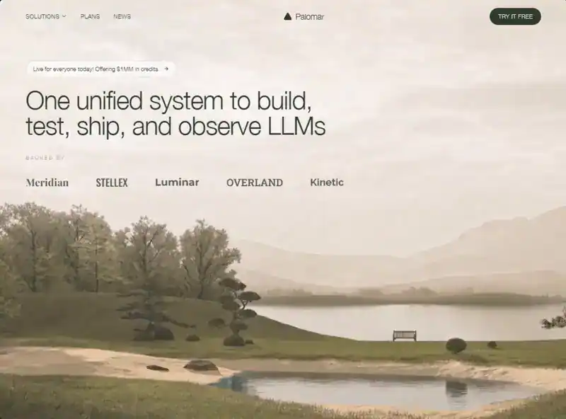
类型:Site模板 · 分类:Agency · 源码:会员可见

Build a standalone pixel-accurate recreation of the Palomar Labs marketing landing page: fixed navbar + full-viewport video hero only. No other sections. Match this spec exactly. Do not invent extra copy, buttons, gradients, overlays, or decorative blobs.

Stack

React + TypeScript + Vite

Tailwind CSS

lucide-react icons: ChevronDown, ArrowRight, Triangle

Single App.tsx with Navbar, Hero, TrustedBy

Exact assets and URLs (do not change)

Background video (must be this exact CloudFront URL):

https://d8j0ntlcm91z4.cloudfront.net/user_38xzZboKViGWJOttwIXH07lWA1P/hf_20260820_010308_b1636845-4c15-4ab6-b0c9-9a29bfb0c6e3.mp4

Fonts in index.html:

<link href="https://db.onlinewebfonts.com/c/0e6de1ec911a2e267ff136bbdd384a44?family=Helvetica+Neue+Light" rel="stylesheet">

<link href="https://fonts.googleapis.com/css2?family=Playfair+Display:wght@700&family=Oswald:wght@500&family=Montserrat:wght@700&family=Roboto+Slab:wght@600&family=Raleway:wght@700&display=swap" rel="stylesheet">

Page title: Palomar - One Unified System for LLMs

Color tokens (Tailwind theme.extend.colors.brand)

dark: #2d3a2e

green: #3d5a3e

light: #f5f3ef

cream: #faf8f5

Font families (Tailwind theme.extend.fontFamily)

helvetica-neue: "Helvetica Neue Light", Helvetica, Arial, sans-serif

playfair: "Playfair Display", serif

oswald: "Oswald", sans-serif

montserrat: "Montserrat", sans-serif

roboto-slab: "Roboto Slab", serif

raleway: "Raleway", sans-serif

Body: font-family: 'Helvetica Neue Light', Helvetica, Arial, sans-serif; with antialiasing. Global * { margin:0; padding:0; box-sizing:border-box; }. html { scroll-behavior: smooth; }. Root app wrapper: font-helvetica-neue. Background of the hero section: bg-brand-cream (#faf8f5).

Animations (global CSS, exact)

@keyframes fade-up {

  from { opacity: 0; transform: translateY(20px); }

  to   { opacity: 1; transform: translateY(0); }

}

@keyframes fade-down {

  from { opacity: 0; transform: translateY(-12px); }

  to   { opacity: 1; transform: translateY(0); }

}

.animate-fade-up   { animation: fade-up 0.8s cubic-bezier(0.16, 1, 0.3, 1) both; }

.animate-fade-down { animation: fade-down 0.7s cubic-bezier(0.16, 1, 0.3, 1) both; }

.stagger-1 { animation-delay: 0ms; }

.stagger-2 { animation-delay: 120ms; }

.stagger-3 { animation-delay: 240ms; }

.stagger-4 { animation-delay: 360ms; }

.stagger-5 { animation-delay: 480ms; }

.stagger-6 { animation-delay: 600ms; }

1) Navbar

Fixed top-0 left-0 right-0 z-50. Transition duration-300.

If window.scrollY > 20: bg-brand-cream/90 backdrop-blur-md shadow-sm

Else: bg-transparent

Inner container: max-w-7xl mx-auto px-6 lg:px-8. Bar: relative flex items-center h-16 md:h-20.

Desktop left links (hidden md:flex items-center gap-8, animate-fade-down stagger-1)

All: text-sm text-brand-dark tracking-wide uppercase hover:opacity-70 transition-opacity

Button: Solutions + ChevronDown w-3.5 h-3.5, flex items-center gap-1

Anchor: Plans

Anchor: News

Center logo (absolute centered)

absolute left-1/2 -translate-x-1/2 flex items-center gap-2 animate-fade-down stagger-2

Lucide Triangle: w-5 h-5 text-brand-dark fill-brand-dark

Text Palomar: text-xl text-brand-dark tracking-tight font-helvetica-neue

Desktop CTA (right)

hidden md:inline-flex items-center ml-auto px-5 py-2.5 bg-brand-dark text-white text-sm tracking-wide uppercase rounded-full hover:bg-brand-green transition-colors animate-fade-down stagger-3 Label: Try It Free

Mobile hamburger (md:hidden, ml-auto, z-50, w-10 h-10, aria-label="Toggle menu")

Two 2px bars (w-6 h-[2px] bg-brand-dark rounded) with transition-all duration-300 ease-[cubic-bezier(0.68,-0.6,0.32,1.6)]:

Top bar at top-[6px]. Open: rotate-45 translate-y-[5px]

Bottom bar at top-[13px]. Open: -rotate-45 When open, lock document.body.style.overflow = 'hidden'.

Mobile overlay (md:hidden)

fixed inset-0 bg-brand-cream z-40 Transition duration-500 ease-[cubic-bezier(0.22,1,0.36,1)]

Open: opacity-100 pointer-events-auto

Closed: opacity-0 pointer-events-none

Inner column: flex flex-col items-center justify-center h-full gap-8, same 500ms ease, delay-100

Open: translate-y-0 opacity-100

Closed: -translate-y-8 opacity-0

Links (each text-3xl text-brand-dark tracking-tight): Solutions, Plans, News CTA: mt-4 inline-flex items-center px-8 py-3.5 bg-brand-dark text-white text-lg tracking-wide rounded-full → Try It Free Clicking any item closes the menu.

No dropdown panel for Solutions — it is a button on desktop and a simple link on mobile.

2) Hero

section.relative.w-full.h-screen.min-h-[700px].overflow-hidden.bg-brand-cream

Video layer

div.absolute.inset-0 wrapping <video>:

src = the CloudFront URL above

autoPlay muted loop playsInline

class: w-full h-full object-cover object-bottom

No dark overlay, no gradient, no poster image

Content column (sits on top of video, left-aligned, not vertically centered)

relative z-10 flex flex-col items-start max-w-7xl mx-auto pt-28 md:pt-36 px-6 lg:px-8

Announcement pill

Anchor, inline-flex items-center gap-2 px-4 py-2 rounded-full border border-brand-dark/15 bg-white/60 backdrop-blur-sm hover:bg-white/80 transition-colors mb-5 md:mb-6 animate-fade-up stagger-3

Text text-sm text-brand-dark: Live for everyone today! Offering $1MM in credits.

ArrowRight w-3.5 h-3.5 text-brand-dark

Headline

h1 classes: text-left text-3xl sm:text-4xl md:text-5xl lg:text-6xl text-brand-dark leading-[1.05] tracking-tight max-w-4xl font-helvetica-neue animate-fade-up stagger-4

Exact copy with a line break only from sm and up:

One unified system to build,

test, ship, and observe LLMs

Implementation: first line, then <br className="hidden sm:block" />, then a space, then test, ship, and observe LLMs. On <640px it wraps naturally as one block.

No subtitle, no primary CTA in the hero body.

3) Trusted by (inside Hero, under headline)

Wrapper: w-full mt-8 md:mt-10 animate-fade-up stagger-5

Label: text-left text-xs tracking-[0.25em] uppercase text-brand-dark/50 mb-6 md:mb-8 font-helvetica-neue → Backed by

Logo row: flex flex-wrap items-center justify-start gap-6 md:gap-12 lg:gap-16 animate-fade-up stagger-6

Five wordmarks as text (not images), text-lg md:text-xl lg:text-2xl text-brand-dark/80 whitespace-nowrap:

Meridian — font-playfair (Playfair Display 700)

STELLEX — font-oswald uppercase (Oswald 500)

Luminar — font-montserrat (Montserrat 700)

OVERLAND — font-roboto-slab uppercase (Roboto Slab 600)

Kinetic — font-raleway (Raleway 700)

Responsive rules (must match)

< md (768px): hamburger + full-screen cream overlay; hide desktop links and CTA; nav height h-16; hero padding pt-28 px-6; logo gaps gap-6; headline text-3xl then sm:text-4xl

md+: three left links, centered logo, right pill CTA; nav h-20; hero pt-36; logo gaps md:gap-12

lg+: container px-8; headline lg:text-6xl; logo gaps lg:gap-16

Hero always h-screen with min-h-[700px]

Content always left-aligned (items-start, text-left, justify-start)

Video always object-cover object-bottom so the bottom of the footage stays framed

Visual character

Quiet, editorial, cream/forest. Light Helvetica Neue, not heavy Inter/SF. Centered triangle + Palomar wordmark. Frosted white pill over a full-bleed landscape video. Wordmark “logos” in mixed display fonts, not SVG brand files. Entrance: nav fades down (stagger 0 / 120 / 240ms); pill, headline, backed-by fade up (240 / 360 / 480 / 600ms).

Do not add

Footer, extra sections, search, language switcher, social icons, video controls, mute button, overlay scrim, second headline, hero “Get started” button, Solutions mega-menu content, or any other video URL.

Implement this as one working page that looks identical on desktop and mobile.