类型:Site模板 · 分类:Business · 源码:会员可见
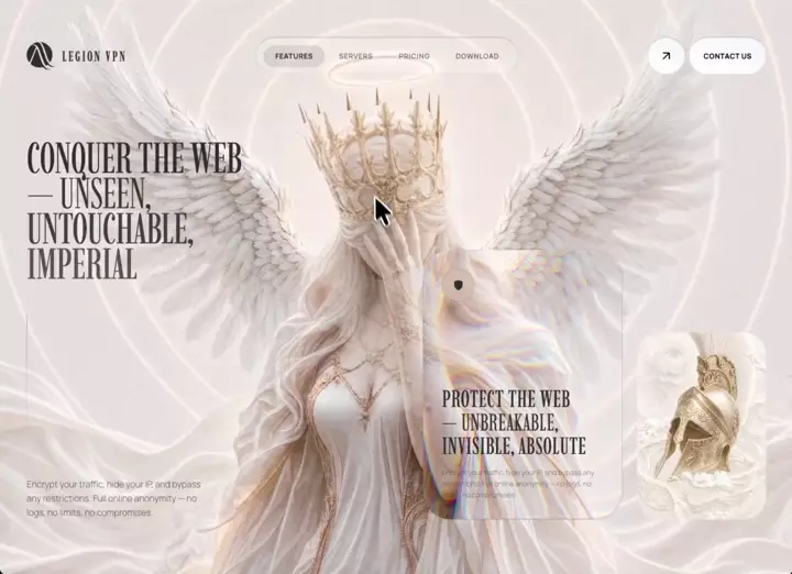
**Build a single self-contained `index.html` (inline CSS + JS, no framework) that recreates this Legion VPN hero landing page pixel-for-pixel.** One viewport-tall page only. Do **not** render a second section, marquee, or info cards in the DOM even if you copy leftover CSS. Title: `Legion VPN`. `lang="en"`. `body` class = `stage`. Background stack container class = `flower`.


## Fonts (exact)


Google Fonts:

```

https://fonts.googleapis.com/css2?family=Imbue:opsz,wght@10..40,100..900&family=Manrope:wght@200..800&display=swap

```

Preconnect `fonts.googleapis.com` and `fonts.gstatic.com` (gstatic `crossorigin`).


```

--font-sans: "Manrope", ui-sans-serif, system-ui, sans-serif;

--font-display: "Imbue", serif;

```

Body: Manrope. All display/headlines/logo: Imbue. All UI labels: Manrope, 12px, weight 700, uppercase, letter-spacing `0.05em`.


## Palette / surface


- Page `html, body`: `#000`, `overflow-x: hidden`

- Fixed background fallback: `#f4f0ea`

- Ink: `#2F2F2F`

- Muted body: `rgba(47,47,47,0.64)`

- Grid stroke: `#64748b` at 0.1 opacity

- Glass buttons: `linear-gradient(to top right, #fff, #f3f4f6)` with border `1px solid rgba(47,47,47,0.18)` and brighter top edge `rgba(47,47,47,0.3)`

- Button hover: `linear-gradient(to top right, #e5e5e5, #fff)`

- Easing everywhere: `cubic-bezier(0.16, 1, 0.3, 1)`


## Exact image URLs (do not substitute)


**FRONT lily** (visible default layer + glass-card clone):

```

https://images.higgs.ai/?default=1&output=webp&url=https%3A%2F%2Fd8j0ntlcm91z4.cloudfront.net%2Fuser_38xzZboKViGWJOttwIXH07lWA1P%2Fhf_20260821_051344_66a21fb2-1bb6-4e29-9946-eb6da7611bcc.png&w=1280&q=85

```


**BACK / reveal lily** (only visible through the morph trail):

```

https://images.higgs.ai/?default=1&output=webp&url=https%3A%2F%2Fd8j0ntlcm91z4.cloudfront.net%2Fuser_38xzZboKViGWJOttwIXH07lWA1P%2Fhf_20260819_080405_993b3b84-843c-4105-8e78-0ebf9c43b89f.png&w=1280&q=85

```


**Helmet ornament crop:**

```

https://flick-award-65707097.figma.site/_assets/v11/09548c2c4b3f57f6d08ba1a3eee3341c34f989d2.png

```


All Higgs images: `referrerpolicy="no-referrer"`, `object-fit: cover`.


## Layer stack (fixed, full viewport, `pointer-events: none`, z-index 0)


Container `#bg-media-container.flower`, `position:fixed; inset:0; background:#f4f0ea`.


Z-order, back → front:

1. `#reveal-layer` `<img>` — BACK lily, `z-index:0`. Initial mask = `linear-gradient(transparent, transparent)` so it is fully hidden until the trail paints it.

2. `#bg-image` `<img>` — FRONT lily, `z-index:1`, alt `"Legion Background"`.

3. `#grid-overlay` SVG, `z-index:2`, opacity `0.1`. Pattern 48×48, path `M 48 0 L 0 0 0 48`, stroke `#64748b`, stroke-width `0.6`. Pattern `x/y` are animated from JS for parallax.


UI sits in `#main-layout` above this: `position:relative; z-index:10; min-height:100vh; max-width:1800px; margin:0 auto; padding:48px; display:flex; flex-direction:column; justify-content:space-between`.


## Header (3 columns)


Animate in: `fadeSlideDown` 1.2s, easing above, `forwards`. Padding `16px 0`. `justify-content: space-between`.


**Left — logo**

- SVG `viewBox="0 0 57 56"`, 48×48px, fill `#2F2F2F`, 4 paths (abstract winged/laurel Legion mark). Hover: scale `1.1` in 500ms.

- Wordmark `LEGION VPN`: Imbue, 24px, weight 500, uppercase, letter-spacing `0.12em`, color `#2F2F2F`. Gap 12px.


**Center — glass pill nav** (`#nav-pill`)

- Height 64px, padding `8px 12px`, radius 9999px, gap 4px.

- Border: `1px solid rgba(47,47,47,0.15)`, top `rgba(47,47,47,0.3)`, bottom `rgba(47,47,47,0.08)`. Hover border `rgba(47,47,47,0.3)`.

- Fill: `linear-gradient(to top right, rgba(255,255,255,0.02), rgba(255,255,255,0.25), rgba(255,255,255,0.01))`.

- `backdrop-filter: blur(64px)`.

- Buttons: Features (default `.active`), Servers, Pricing, Download. Padding `10px 20px`, radius pill, 12px/700/uppercase/`0.05em`, color `rgba(47,47,47,0.6)`, hover `#2F2F2F`.

- Active: color `#2F2F2F` + `::before` inset pill `rgba(47,47,47,0.12)`. Click only toggles `.active`. No routing.


**Right — actions**

- Circle 64×64: same white gradient + border. Lucide-style external-link icon (line 7,17 → 17,7 + polyline 7,7 17,7 17,17), 24px, stroke 2.

- Pill `CONTACT US`, height 64, padding `0 24px`, same chrome.

- Gap 6px.


**Mobile:** at `max-width:768px` hide nav + actions, show 44×44 glass hamburger (`rgba(255,255,255,0.3)`, blur 12px, border `rgba(47,47,47,0.2)`). Button exists; no drawer.


## Hero grid


`display:grid; grid-template-columns:1fr 1fr; gap:32px; align-items:end; flex:1; margin-bottom:48px`.


### Left column

`flex column; justify-content:space-between; align-self:stretch; padding-top:96px`.


H1 (Imbue, `5.4vw`, line-height `0.82`, weight 400, tracking `-0.01em`, uppercase, `#2F2F2F`), stacked:

```

CONQUER THE WEB

— UNSEEN,          ← .line-light  weight 300, rgba(47,47,47,0.95)

UNTOUCHABLE,       ← .line-90     rgba(47,47,47,0.9)

IMPERIAL           ← .line-80     rgba(47,47,47,0.8)

```

Each of those three is `display:block`. Animation: `fadeSlideUp` 1.4s, delay 0.2s, `both`.


Then a 1×220px vertical rule, gradient `rgba(47,47,47,0.4) → rgba(47,47,47,0.15) → transparent`, `transform-origin:top`, `scaleYIn` 1.5s delay 0.4s, margin `24px 0`.


Then body copy, Manrope 15px/300, `rgba(47,47,47,0.64)`, line-height 1.6, width 320px:

> Encrypt your traffic, hide your IP, and bypass any restrictions. Full online anonymity — no logs, no limits, no compromises.


`fadeIn` 1.4s delay 0.5s.


### Right column

`flex; align-items:flex-end; justify-content:flex-end; gap:24px`.


**Liquid-glass card** `#glass-card`: 340×460, radius 48px, transparent, border `1px solid rgba(47,47,47,0.15)`, padding 32px, column `space-between`, `overflow:hidden`. Enter: `fadeSlideUpCard` 1.5s delay 0.4s.


Inside, three layers:


1. `#dup-video-container` — absolute, `overflow:hidden`, `pointer-events:none`, z-index 0. Every rAF, pin it to the **viewport** so the card becomes a window onto the same background:

   ```

   left = -card.getBoundingClientRect().left

   top  = -card.getBoundingClientRect().top

   width  = document.documentElement.clientWidth

   height = document.documentElement.clientHeight

   ```

   Two cover imgs inside, `transform:scale(1.06)`, `filter: url(#liquid-glass-refraction)`:

   - `#dup-reveal` — BACK lily, z-index 0, same hidden initial mask

   - `#dup-image` — FRONT lily, z-index 1

   So the glass card shows a **refracted, slightly zoomed clone** of the hero lilies, aligned with the page.


2. `#glass-card-overlay` — inset 0, radius 48, `background:rgba(255,255,255,0.05)`, inset highlight `0 1.5px 2px rgba(255,255,255,0.3)` and inset shadow `0 -1px 2px rgba(0,0,0,0.15)`, z-index 1, no pointer events.


3. Content, relative z-index 10:

   - Top: 56×56 circle, `rgba(255,255,255,0.05)`, border `rgba(47,47,47,0.15)`, blur 80px, filled shield icon 20px `#2F2F2F`. Card hover: icon scale 1.05 / 500ms.

   - Bottom heading Imbue 40px/40px/400/uppercase/tracking `0.02em`:

     ```

     PROTECT THE WEB

     — UNBREAKABLE,     ← .light weight 300

     INVISIBLE, ABSOLUTE

     ```

   - Same anonymity sentence, 12px/19px/300, `rgba(47,47,47,0.5)`.


**Helmet card** `#helmet-card`: 220×320, radius 40px, border `1px solid rgba(255,255,255,0.2)`, overflow hidden. Image cover, `scale(1.40) rotate(15deg)`. Hover: `scale(1.46) rotate(18deg)` in 1s same easing. Enter: `fadeSlideUpHelmet` 1.6s delay 0.6s (from `translateY(80px) scale(0.95)`).


## SVG liquid-glass filter (exact, hidden 0×0 svg)


`filter#liquid-glass-refraction`, region `x="-30%" y="-30%" width="160%" height="160%"`:


1. `feTurbulence` fractalNoise, `baseFrequency="0.012 0.015"`, `numOctaves="3"`

2. Boost SourceAlpha via color matrix `0 0 0 0 0  0 0 0 0 0  0 0 0 0 0  0 0 0 100 0`

3. `feGaussianBlur` stdDeviation **45**

4. `feFuncA` linear slope **-1.3** intercept **1** → edge mask

5. Composite noise × edge (`arithmetic k1=1`)

6. Chromatic displacement of SourceGraphic:

   - R scale **65**

   - G scale **56**

   - B scale **47**

   - isolate each channel with color matrices, `feBlend mode="screen"` R+G then +B


This is edge-only refraction + RGB split. Apply **only** to the duplicated images inside the glass card, not the full-page lilies.


## Mouse morph-reveal trail (implement exactly — not a CSS circle)


Not a radial spotlight. Organic morphing blob trail that **punches holes in the front lily** and **paints the back lily in the same shape**. Same trail drives both the full-page layers and the glass-card clones.


Constants:

```

TRAIL_MAX_POINTS  = 60

TRAIL_HEAD_R      = 140

TRAIL_NOISE_AMP   = 44

TRAIL_BLOB_PTS    = 24

TRAIL_FADE_SPEED  = 0.92

TRAIL_SAMPLE_DIST = 8

```


Each `MorphTrailLayer`:

- Hidden offscreen canvas (`display:none`) sized to `.flower` via `getBoundingClientRect`

- Targets are cover-fit `<img>`s

- Every active frame: `maskImage = url(canvas.toDataURL())`, size `100% 100%`, no-repeat (set both `mask*` and `-webkit-mask*`)


Two layers, **same trail**:

- `invert=false` → FRONT (`#bg-image`, `#dup-image`): fill canvas white, then `destination-out` blobs = holes

- `invert=true` → REVEAL (`#reveal-layer`, `#dup-reveal`): clear canvas, white blobs = only the trail shows


Mouse on **`.stage`**: `mousemove` / `mouseenter` / `mouseleave`. Convert to flower canvas space:

```

scaleX = canvas.width / rect.width

x = (clientX - rect.left) * scaleX

```

same for y.


Per frame:

```

targetR = hovering ? 140 : 0

headRadius += (targetR - headRadius) * (hovering ? 0.14 : 0.04)

```

When hovering and `headRadius > 5`, if distance from last sample `> 8px`, push `{x,y,r:headRadius,alpha:1,seed:random*100}`; cap 60.

Decay: `alpha *= 0.92; r *= 0.995`; remove if `alpha < 0.01`.

`time += 0.016`.

Also draw a live head blob at the current mouse with current `headRadius` and a stable `headSeed`. Leave stage → head lerps shut, trail dies. After trail is gone, render one rest frame so front is fully opaque and reveal is fully hidden.


`drawMorphBlob(ctx, cx, cy, r, t, seed)` — skip if `r < 2`. 24 points:

```

n1 = sin(angle*3 + t*1.4 + seed) * 0.45

n2 = sin(angle*5 - t*0.9 + seed*2.3) * 0.3

n3 = cos(angle*2 + t*1.8 + seed*0.7) * 0.25

noise = (n1+n2+n3) * 44 * (r/140)

```

Closed path via midpoints + `quadraticCurveTo` (organic blob, not a circle). Fill white. Use each point’s `alpha` as `globalAlpha`.


Result: moving the mouse leaves a morphing organic wipe that cuts the front lily away and paints the second lily along a fading trail.


## Grid parallax (same rAF)


```

cx = mouseX/width - 0.5

gridOffset.x += (cx * 16 - gridOffset.x) * 0.06

```

same for y. Write onto the SVG pattern’s `x` and `y` attributes (2 decimal places). Amplitude 16px, lerp 0.06.


## Entrance keyframes (exact)


```

fadeSlideDown     from ty -40

fadeSlideUp       from ty  50

fadeSlideUpCard   from ty  60

fadeSlideUpHelmet from ty  80 + scale 0.95

scaleYIn          from scaleY 0, origin top

fadeIn            from ty  30

```

All to opacity 1 / identity. Timing as listed above.


## Responsive


`max-width: 1024px`: layout padding 24; hero 1 column; heading `10vw`; hero-left padding-top 48; cards wrap start.


`max-width: 768px`: hide desktop nav/actions; show hamburger; glass card width 100%; helmet 180×260; heading `12vw`.


## Constraints


- One HTML file. No comments in code.

- No second-section markup. No fake pages behind nav.

- Do not replace the three image URLs.

- Do not simplify liquid glass to blur-only. Do not simplify the trail to a CSS radial mask.

- Glass card background must stay aligned with the page lilies while scrolling/resizing (continuous rAF sync).

- Wordmark/UI stay sharp on top; they are not masked. Only the lily `<img>`s are masked.