类型:Site模板 · 分类:未分类 · 收录:2026-09-15 23:37:25 · 源码:会员可见
Build a single, self-contained HTML file named `index.html`. No frameworks, no build step, no
dependencies, no external CSS or JS. All CSS goes in one <style> block in <head>; all JS in one
<script> block immediately before </body>. Output the complete file and nothing else.

================================================================================
WHAT IT IS
================================================================================
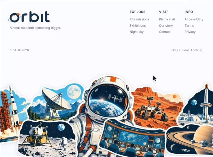
A full-viewport, non-scrolling landing page for a space museum brand called "orbit".
A header block (logo + tagline on the left, three nav columns on the right, a meta row
underneath) sits on a near-white background. Below it, a collage of 8 die-cut illustrated
"stickers" forms a horizon that bleeds off the bottom of the screen. The page plays one
entrance animation on load and is then completely still. After the entrance, every sticker
becomes draggable with the mouse or a finger.

================================================================================
DOCUMENT SHELL
================================================================================
<!DOCTYPE html>, <html lang="en">.
<head> contains, in this order:
  <meta charset="utf-8">
  <meta name="viewport" content="width=device-width,initial-scale=1,viewport-fit=cover">
  <meta name="theme-color" content="#FAFBFF">
  <title>orbit — A small step into something bigger.</title>
  <style> ... </style>

================================================================================
FONTS
================================================================================
Self-hosted Inter, declared under the custom family name 'InterEmb', three weights, all
with font-display:block:

@font-face{font-family:'InterEmb';font-style:normal;font-weight:400;font-display:block;
  src:url(assets/fonts/inter-400.woff2) format('woff2')}
@font-face{font-family:'InterEmb';font-style:normal;font-weight:500;font-display:block;
  src:url(assets/fonts/inter-500.woff2) format('woff2')}
@font-face{font-family:'InterEmb';font-style:normal;font-weight:600;font-display:block;
  src:url(assets/fonts/inter-600.woff2) format('woff2')}

(If those local .woff2 files are not available in your environment, replace the three
@font-face rules with a Google Fonts link for Inter weights 400;500;600 and use
font-family:'Inter' in the stack below. Do not change any other value.)

Body stack and rendering:
body{
  font-family:'InterEmb',-apple-system,BlinkMacSystemFont,'Segoe UI',Helvetica,Arial,sans-serif;
  -webkit-font-smoothing:antialiased;-moz-osx-font-smoothing:grayscale;
  text-rendering:geometricPrecision;
}

Reset:
html,body{height:100%;overflow:hidden;background:#FAFBFF}

================================================================================
COLOR TOKENS (use these exact values, nowhere else any other color)
================================================================================
Background / theme ........ #FAFBFF
Logo ink (wordmark) ....... #17324B
Planet dot ................ #DE5F35
Nav column headings ....... #33343A
Tagline + nav links ....... #6E6E73
Meta row .................. #7A7A7E
Link hover / focus ........ #17324B
Sticker rest shadow ....... rgba(24,46,72,.13)
Sticker held shadow ....... rgba(24,46,72,.22)
Logo ring gradient ........ #7E9FBC -> #B9A8AA (at 45%) -> #E08A63

================================================================================
THE SCALING SYSTEM — this is the core of the design, get it exactly right
================================================================================
Nothing uses rem or fixed px on desktop. Two CSS custom properties on .stage drive
everything, so the whole composition scales as one object.

  --u  = layout unit for the HEADER block. 1u = 1px in a 1280x694 reference design.
  --cu = layout unit for the STICKER COLLAGE. Always large enough to cover full width.
  K = 264 is the topmost visible pixel of the collage in reference space.

.stage{
  --u : min(calc(100vw / 1280), calc(100vh / 560));
  --cu: max(calc(100vw / 1280), calc(100vh / 820));
  position:fixed;inset:0;overflow:hidden;background:#FAFBFF;
  isolation:isolate;
}

--u uses min() so the header shrinks to fit whichever axis is tighter.
--cu uses max() so the collage always overflows rather than leaving a gap.

================================================================================
STRUCTURE (body markup, in this exact order)
================================================================================
<main class="stage">
  <div class="collage" aria-hidden="true">   <- 8 <img class="st st-0..st-7">
  <header class="head">
    <div class="brand">    <- inline <svg class="logo"> + <p class="tagline">
    <nav class="nav" aria-label="Footer">   <- three <div class="nav-col c0/c1/c2">
    <div class="meta">     <- two <span>
</main>

The collage comes FIRST in source order and the header second. .collage is z-index:1,
.head is z-index:2, .meta is z-index:2.

Note: .brand and .nav have NO desktop styles at all. On desktop they are transparent
wrappers and the absolute coordinates on .logo/.tagline/.nav-col do the positioning.
They only become layout containers at the tablet breakpoint and below.

================================================================================
COLLAGE — desktop geometry
================================================================================
.collage{
  position:absolute;left:50%;
  width:calc(1280 * var(--cu));
  height:calc(694 * var(--cu));
  top:calc(max(100vh - 430 * var(--cu), 264 * var(--u)) - 264 * var(--cu));
  transform:translateX(-50%);
  z-index:1;
}

.st{
  position:absolute;display:block;
  transform-origin:50% 50%;
  filter:drop-shadow(0 calc(3 * var(--cu)) calc(9 * var(--cu)) rgba(24,46,72,.13));
  -webkit-user-select:none;user-select:none;-webkit-user-drag:none;
}

Every sticker declares --rot (its resting tilt) and --seq (its entrance order), and its
transform is ALWAYS:
  transform:translate(calc(var(--ox,0) * var(--cu)),calc(var(--oy,0) * var(--cu))) rotate(var(--rot))
--ox/--oy default to 0 and are written by the drag script in reference units, so a moved
sticker keeps its proportional position across breakpoints.

Exact per-sticker values (all left/top/width/height are calc(N * var(--cu))):

 class  --rot    --seq   left      top      width     height
 .st-0  -7.5deg   0      -16.8     304.4    316.6     317.2
 .st-1  -1.0deg   1      210.4     296.1    369.2     239.8
 .st-2   4.5deg   2      685.2     314.9    386.6     243.1
 .st-3   1.0deg   3     1006.0     296.5    305.0     253.1
 .st-4   8.5deg   4      362.1     250.6    528.7     609.7
 .st-5   1.5deg   5      164.6     489.4    331.8     221.2
 .st-6  11.5deg   6      600.2     506.0    365.6     199.9
 .st-7   1.5deg   7      942.1     511.2    334.8     179.6

.st-4 is the large foreground astronaut. All 8 images have alt="" (decorative; the
container carries aria-hidden="true").

Image sources — use these exact URLs in this exact order:
 st-0  https://soft-zoom-63098134.figma.site/_assets/v11/4e43afb15f0551eb4f190ccf176bfedc64d8bcc8.png
 st-1  https://soft-zoom-63098134.figma.site/_assets/v11/cec0cfbe754899e9ab12d7b565d80aa0bb509bdc.png
 st-2  https://soft-zoom-63098134.figma.site/_assets/v11/f9fa66f408dfbca6fc559e55d73794791cccd525.png
 st-3  https://soft-zoom-63098134.figma.site/_assets/v11/56c411ed85089043f023f3eb2ac4db8df8a717ea.png
 st-4  https://soft-zoom-63098134.figma.site/_assets/v11/ed08c00d12522d4840ac39d3e08581f4851c4574.png
 st-5  https://soft-zoom-63098134.figma.site/_assets/v11/1a2b742b669d398fee469b25819454dce3e46ff2.png
 st-6  https://soft-zoom-63098134.figma.site/_assets/v11/f1835dcf6a666aeda21a659091335d5ff36cc895.png
 st-7  https://soft-zoom-63098134.figma.site/_assets/v11/c0d45fc6cd3cfd1b5921665f010e1ec545efd6d3.png

They are transparent-background PNG die-cut illustrations in a flat, mid-century
technical-illustration style — rocket on a launch pad, radio telescope, lunar lander,
an astronaut helmet reflecting Earth, a Mars rover, a spacecraft cockpit, a domed Mars
colony, and Saturn.

================================================================================
HEADER — desktop geometry (all values calc(N * var(--u)))
================================================================================
.head{position:absolute;top:0;left:50%;width:calc(1077 * var(--u));
      height:calc(300 * var(--u));transform:translateX(-50%);z-index:2}

.logo{position:absolute;left:calc(-7.5 * var(--u));top:calc(100 * var(--u));
      width:calc(188 * var(--u));height:calc(56 * var(--u));overflow:visible}

.tagline{position:absolute;left:calc(1.5 * var(--u));top:calc(171.76 * var(--u));
      font-size:calc(11.7 * var(--u));line-height:1;font-weight:400;letter-spacing:0;
      color:#6E6E73;white-space:nowrap}

.nav-col{position:absolute;top:0}
.c0{left:calc(750.0 * var(--u))}
.c1{left:calc(874.5 * var(--u))}
.c2{left:calc(1008.5 * var(--u))}

.nav-h{position:absolute;top:calc(116.44 * var(--u));left:0;
      font-size:calc(13.3 * var(--u));line-height:1;font-weight:600;
      letter-spacing:calc(.014 * 13.3 * var(--u));color:#33343A;white-space:nowrap}

.nav-l{position:absolute;top:calc(138.66 * var(--u));left:0;list-style:none}
.nav-l li{font-size:calc(11.7 * var(--u));line-height:calc(27.5 * var(--u));white-space:nowrap}
.nav-l a{color:#6E6E73;text-decoration:none;letter-spacing:0;transition:color .18s ease}
.nav-l a:hover,.nav-l a:focus-visible{color:#17324B}

.meta{position:absolute;top:calc(278.56 * var(--u));left:calc(.5 * var(--u));
      right:calc(-2.5 * var(--u));display:flex;justify-content:space-between;
      align-items:baseline;font-size:calc(11.7 * var(--u));line-height:1;
      color:#7A7A7E;letter-spacing:0;white-space:nowrap;z-index:2}

================================================================================
CONTENT (verbatim)
================================================================================
Tagline:  A small step into something bigger.
Column 1 heading EXPLORE -> The missions / Exhibitions / Night sky
Column 2 heading VISIT   -> Plan a visit / Our story / Contact
Column 3 heading INFO    -> Accessibility / Terms / Privacy
All nav links href="#". Headings are literal uppercase text in the HTML, not text-transform.
Meta row left span:  orbit. © 2026
Meta row right span: Stay curious. Look up.

================================================================================
LOGO — inline SVG, reproduce exactly
================================================================================
<svg class="logo" viewBox="94 100 188 56" role="img" aria-label="orbit">
  <defs>
    <linearGradient id="ringG" x1="96" y1="142" x2="153" y2="122" gradientUnits="userSpaceOnUse">
      <stop offset="0" stop-color="#7E9FBC"/>
      <stop offset=".45" stop-color="#B9A8AA"/>
      <stop offset="1" stop-color="#E08A63"/>
    </linearGradient>
  </defs>
  <g fill="none" stroke="url(#ringG)" stroke-width="2.1">
    <ellipse cx="124.5" cy="133" rx="29" ry="10.6" transform="rotate(-22 124.5 133)"/>
  </g>
  <g fill="none" stroke="#17324B" stroke-linecap="round" stroke-linejoin="round">
    <ellipse cx="123.5" cy="132.6" rx="17" ry="16.3" stroke-width="8"/>
    <path d="M158.5 147V127c0-6.4 5.5-8.7 12-8.7h4.1" stroke-width="9"/>
    <path d="M192.5 108.5v38.5" stroke-width="9"/>
    <ellipse cx="208.5" cy="132.5" rx="16.25" ry="15" stroke-width="8"/>
    <path d="M242.5 119.5V147" stroke-width="9"/>
    <path d="M260.5 108.5v33c0 5 3 6 10.5 5.8" stroke-width="9"/>
    <path d="M260 118.4h9.6" stroke-width="7.4"/>
  </g>
  <circle class="planet" cx="139.5" cy="116.5" r="5.1" fill="#DE5F35"/>
</svg>

It is the lowercase wordmark "orbit" in a heavy rounded geometric stroke style, with a
gradient orbital ring tilted -22deg around the leading "o", and a small orange planet dot
riding the ring at its upper right. The ring gradient runs cool blue to warm orange.

================================================================================
RESPONSIVE — three breakpoints, in this order
================================================================================

--- TABLET: @media (max-width:1199.98px),(orientation:portrait) -------------
Breakpoint is derived from typography, not devices: body copy is 11.7px at the 1280
reference and falls below 11px at 1203px, so desktop holds down to 1200px — which keeps
it active for laptops and landscape iPad Pro. Portrait viewports switch regardless of width.
The architecture keeps the desktop's defining relationship (brand left, three nav columns
right, meta spanning underneath); only the technique changes — absolute coordinates become
a wrapping flex row, so the composition breathes instead of shrinking.

.stage{--cu: max(calc(100vw / 1120), calc(100vh / 940));display:block}
.collage{top:auto;bottom:0;height:calc(694 * var(--cu))}
.head{position:static;transform:none;width:100%;height:auto;
      padding:clamp(30px,6.4vh,80px) clamp(26px,4.6vw,72px) 0;
      display:flex;flex-wrap:wrap;align-items:flex-start;
      column-gap:clamp(30px,5vw,90px);row-gap:clamp(24px,3.6vh,48px)}
.brand{--logo-w:clamp(160px,16vw,200px);flex:0 1 auto;min-width:0}
.logo{position:static;display:block;width:var(--logo-w);height:auto;
      margin-left:calc(var(--logo-w) * -0.0479)}
      /* the wordmark starts 9/188 into the viewBox — pull it back so the 'o'
         optically aligns with the tagline, exactly as on desktop */
.tagline{position:static;margin-top:clamp(9px,1.3vh,16px);
      font-size:clamp(11.5px,1.02vw,12.6px);line-height:1.4;letter-spacing:-.004em;
      white-space:normal}
.nav{margin-left:auto;display:grid;
      grid-template-columns:repeat(3,minmax(0,max-content));
      column-gap:clamp(26px,4.6vw,64px)}
.nav-col{position:static}
.c0,.c1,.c2{left:auto}
.nav-h{position:static;font-size:clamp(11.8px,1.12vw,13.3px);letter-spacing:.055em;
      margin-bottom:clamp(10px,1.5vh,18px)}
.nav-l{position:static}
.nav-l li{font-size:clamp(11.5px,1.02vw,12.6px);line-height:clamp(23px,3.4vh,30px);
      white-space:nowrap}
.meta{position:static;flex:0 0 100%;margin-top:clamp(26px,4.4vh,60px);
      font-size:clamp(11px,.98vw,12.2px)}

--- MOBILE: @media (max-width:559.98px) -------------------------------------
Breakpoint measured, not assumed: the tablet two-part row keeps a healthy brand-to-nav gap
down to 560px (69px). Below that it collapses fast — 540px->49px, 520px->29px, 500px->9px,
480px->overlap. The three nav columns STAY a row; that trio is the composition's signature
and still fits at 320px. What changes is that the brand takes full width above the nav.
Values are tuned to meet the tablet layer at the boundary so nothing visibly jumps.

.stage{--cu: min(max(calc(100vw / 840), calc(100dvh / 940)), calc(100vw / 580));
       height:100dvh}
.head{padding:clamp(28px,6.5vh,76px)
              max(7.2vw,env(safe-area-inset-right)) 0
              max(7.2vw,env(safe-area-inset-left));
      row-gap:clamp(26px,5vh,58px);column-gap:0}
.brand{--logo-w:clamp(150px,28.6vw,190px);flex:0 0 100%}
.tagline{margin-top:clamp(8px,1.3vh,15px);font-size:clamp(11.8px,3.1vw,13.2px)}
.nav{margin-left:0;flex:0 0 100%;grid-template-columns:repeat(3,minmax(0,1fr));
     column-gap:clamp(12px,3.4vw,28px)}
.nav-h{font-size:clamp(11px,2.9vw,13px);margin-bottom:clamp(9px,1.6vh,17px)}
.nav-l li{font-size:clamp(11.5px,3vw,13px);line-height:clamp(24px,4vh,34px);
     white-space:nowrap}
.meta{margin-top:clamp(24px,4.6vh,56px);font-size:clamp(10.8px,2.8vw,12.4px)}

--- SHORT LANDSCAPE ---------------------------------------------------------
@media (max-width:1199.98px) and (max-height:560px) and (min-aspect-ratio:1/1)
Phones on their side and stubby windows. Vertical room, not width, is the constraint:
keep the two-part row, tighten the rhythm, let the collage bleed further below.

.stage{--cu: max(calc(100vw / 1280), calc(100vh / 1500))}
.collage{bottom:calc(-110 * var(--cu))}
.head{padding:12px 5vw 0;row-gap:14px;column-gap:clamp(24px,4vw,60px)}
.brand{--logo-w:clamp(112px,15vw,158px);flex:0 1 auto}
.tagline{margin-top:6px;font-size:11px}
.nav{margin-left:auto;flex:0 1 auto;
     grid-template-columns:repeat(3,minmax(0,max-content));
     column-gap:clamp(18px,3.4vw,44px)}
.nav-h{font-size:10.5px;margin-bottom:7px}
.nav-l li{font-size:11px;line-height:19px;white-space:nowrap}
.meta{margin-top:10px;font-size:10px}

Then: @media (prefers-reduced-motion:reduce){*{transition:none !important}}

================================================================================
ENTRANCE ANIMATION — one sequence on load, then the page is still
================================================================================
Direction: the composition is a horizon with a brand above it, and the mark is literally
an orbit. So: the wordmark rises out of its own baseline, the horizon lifts into place
behind it in true z-order (back row, astronaut, front row landing on top), the supporting
type follows reading order left to right, and the planet arrives on its ring last of the
brand beats — the one moment of character.

Four behaviours only:
  A  masked rise  -> logo lockup, tagline (the two type moments)
  B  soft rise    -> nav + meta (11px type: opacity and 6px is all it can carry)
  C  settle       -> stickers (14px, 0.985 scale)
  D  arrival      -> planet (scale from 0.5)

fill-mode is BACKWARDS everywhere, deliberately: it holds the from-state during the delay
(no flash of unanimated content) and hands every element back to its authored CSS when the
tween ends. Nothing is left carrying a transform, an opacity or a clip-path. The rest state
IS the original stylesheet. No loops, no iteration counts above 1, no JS, no observers.
When the last sticker lands at 1.75s the page is inert.

@keyframes riseMask{
  from{opacity:0;transform:translateY(100%);clip-path:inset(0 -4% 0 -4%)}
  to  {opacity:1;transform:translateY(0);clip-path:inset(-70% -4% -70% -4%)}
}
@keyframes softRise{
  from{opacity:0;transform:translateY(6px)}
  to  {opacity:1;transform:translateY(0)}
}
@keyframes settle{
  from{opacity:0;transform:translateY(14px) scale(.985) rotate(var(--rot))}
  to  {opacity:1;transform:translateY(0) scale(1) rotate(var(--rot))}
}
@keyframes arrive{
  from{opacity:0;transform:scale(.5)}
  to  {opacity:1;transform:scale(1)}
}

.logo   {animation:riseMask .9s cubic-bezier(.16,1,.3,1) .08s backwards}
.tagline{animation:riseMask .7s cubic-bezier(.16,1,.3,1) .36s backwards}
.planet {transform-box:fill-box;transform-origin:center;
         animation:arrive .44s cubic-bezier(.16,1,.3,1) .66s backwards}

.nav-h,.nav-l li,.meta{animation:softRise .55s cubic-bezier(.22,1,.36,1) backwards}
.c0 .nav-h{animation-delay:.54s}
.c1 .nav-h{animation-delay:.61s}
.c2 .nav-h{animation-delay:.68s}
.c0 .nav-l li:nth-child(1){animation-delay:.600s}
.c0 .nav-l li:nth-child(2){animation-delay:.645s}
.c0 .nav-l li:nth-child(3){animation-delay:.690s}
.c1 .nav-l li:nth-child(1){animation-delay:.670s}
.c1 .nav-l li:nth-child(2){animation-delay:.715s}
.c1 .nav-l li:nth-child(3){animation-delay:.760s}
.c2 .nav-l li:nth-child(1){animation-delay:.740s}
.c2 .nav-l li:nth-child(2){animation-delay:.785s}
.c2 .nav-l li:nth-child(3){animation-delay:.830s}

/* the closing line, alone, after everything else has committed */
.meta{animation-duration:.62s;animation-delay:1.06s}

/* the horizon lifts in z-order: back row, astronaut, front row */
.st{animation:settle .9s cubic-bezier(.19,1,.22,1) backwards;
    animation-delay:calc(.46s + var(--seq) * .055s)}

@media (prefers-reduced-motion:reduce){
  .logo,.tagline,.planet,.nav-h,.nav-l li,.meta,.st{animation:none}
}

================================================================================
STICKER BOARD — grab any sticker and move it
================================================================================
Behaviour:
  grab    -> comes to the front, scales 1 -> 1.06 in ~0.17s, shadow deepens
             (it is off the surface now)
  drag    -> follows the pointer 1:1 from the point you grabbed. No tilt, no lag,
             no inertia.
  release -> scales back to 1 in ~0.2s, stays where dropped, keeps its new place
             in the stack.
Offsets are stored in reference units (multiplied by --cu) so a moved sticker stays
proportionally in place across breakpoints.

Uses the `scale` property (not transform) for the grab pop, so it composes with the
rotate/translate transform instead of overwriting it. This is essential — do not
fold it into transform.

.st{pointer-events:auto;touch-action:none;-webkit-user-drag:none;scale:1;
    transition:scale .18s cubic-bezier(.2,.8,.2,1),
               filter .18s cubic-bezier(.2,.8,.2,1)}
.stage.ready .st{cursor:grab}
.stage.ready .st.held{cursor:grabbing;scale:1.06;
    filter:drop-shadow(0 calc(9 * var(--cu)) calc(20 * var(--cu)) rgba(24,46,72,.22))}
@media (prefers-reduced-motion:reduce){.st{transition:none}}

JavaScript — one IIFE, Pointer Events only, delegated on .collage:

(function(){
  var stage=document.querySelector('.stage'),
      collage=document.querySelector('.collage'),
      zTop=10, armed=false, held=null, ox=0, oy=0, sx=0, sy=0, unit=1;

  /* the board only becomes live once the entrance has resolved */
  setTimeout(function(){ armed=true; stage.classList.add('ready'); }, 1800);

  function cu(){ /* resolved px value of one reference unit */
    var r=collage.getBoundingClientRect(); return r.width/1280;
  }

  collage.addEventListener('pointerdown',function(e){
    var el=e.target.closest('.st');
    if(!armed||!el||e.button) return;
    e.preventDefault();
    held=el; unit=cu();
    ox=parseFloat(el.style.getPropertyValue('--ox'))||0;
    oy=parseFloat(el.style.getPropertyValue('--oy'))||0;
    sx=e.clientX; sy=e.clientY;
    el.style.zIndex=++zTop;            /* comes to the front, and stays there */
    el.classList.add('held');
    el.setPointerCapture(e.pointerId);
  });

  collage.addEventListener('pointermove',function(e){
    if(!held) return;
    held.style.setProperty('--ox', ox+(e.clientX-sx)/unit);
    held.style.setProperty('--oy', oy+(e.clientY-sy)/unit);
  });

  function drop(e){
    if(!held) return;
    held.classList.remove('held');
    try{ held.releasePointerCapture(e.pointerId); }catch(err){}
    held=null;
  }
  collage.addEventListener('pointerup',drop);
  collage.addEventListener('pointercancel',drop);
  collage.addEventListener('lostpointercapture',drop);
})();

================================================================================
ACCEPTANCE CRITERIA
================================================================================
1. The page never scrolls at any viewport size (html,body overflow:hidden).
2. At 1280x694 the layout matches the reference coordinates pixel for pixel.
3. Resizing the window scales the whole composition smoothly with no reflow jumps
   and no element collisions at any width from 320px to 2560px.
4. The entrance runs exactly once and completes at 1.75s; afterwards no element
   retains an inline transform, opacity or clip-path from the animation.
5. Stickers are not draggable before 1.8s, and are draggable after.
6. A dragged sticker keeps its rotation while being dragged and stays where dropped.
7. prefers-reduced-motion:reduce disables all animations and transitions but leaves
   the final layout identical.
8. No console errors. No network requests other than the 8 PNGs and the 3 font files.