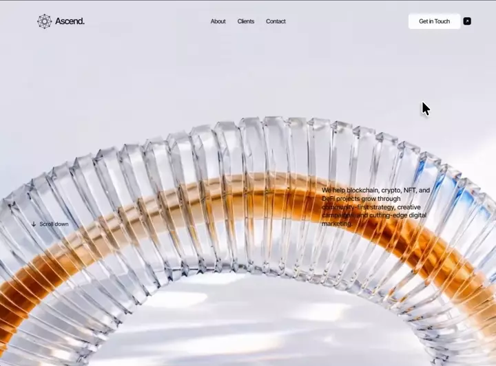
类型:Site模板 · 分类:未分类 · 收录:2026-09-15 23:37:14 · 源码:会员可见
Build a single, self-contained `index.html` file — one file containing all markup, CSS, and
JavaScript inline. No build step, no bundler, no frameworks, no external JS libraries, no
Tailwind. Vanilla HTML + CSS + ES5-compatible JS only. The result must be a pixel-faithful
recreation of the spec below.

================================================================================
0. WHAT THIS PAGE IS
================================================================================
A dark-on-light, editorial landing page for a Web3 marketing agency called "Ascend."
Three stacked sections (hero, agency statement, clients) float above ONE fixed,
full-viewport background video whose playhead is scrubbed by scroll position. The
background layer never translates or scales — it only changes frame. Aesthetic: pale
cool-grey studio light (#e9ebf1), frosted-glass UI surfaces, a single orange accent,
tight negative letter-spacing, and italic serif accents inside a neo-grotesque headline.

Page title: `Ascend — Powering the next generation of web3 brands`
`<html lang="en">`, `<meta charset="utf-8">`,
`<meta name="viewport" content="width=device-width, initial-scale=1, viewport-fit=cover">`

================================================================================
1. EXACT ASSET URLS — USE THESE VERBATIM, DO NOT SUBSTITUTE OR INVENT
================================================================================
Hero poster image (frame 0 of the video, so the photo→video handover is invisible):
  https://d2ol7oe51mr4n9.cloudfront.net/user_38xzZboKViGWJOttwIXH07lWA1P/1b38db1d-46ed-4a05-a669-9edaad8625b6.jpg

Scroll-scrubbed background video, 1920x1080 all-intra H.264 (large screens):
  https://d2ol7oe51mr4n9.cloudfront.net/user_38xzZboKViGWJOttwIXH07lWA1P/019940d3-f06f-491c-bd49-41cfb8183cc1.mp4

Scroll-scrubbed background video, 1280x720 all-intra H.264 (small / low-DPR / save-data):
  https://d2ol7oe51mr4n9.cloudfront.net/user_38xzZboKViGWJOttwIXH07lWA1P/b067715a-adae-4480-ae1e-178287f5ed6d.mp4

The poster <img> carries an inline onerror that falls back to a local file once only:
  onerror="this.onerror=null;this.src='assets/hero-background.jpg'"

Video content, for reference when tuning the timeline (duration ~9.92s): it is two
chained 5s keyframe-interpolated renders joined with a 0.2s crossfade at a shared frame.
Beats: 0–25% a glass arch (frame 1); 30–48% the arch rises and rolls; 50–70% a glass
tower standing on the right (frame 2); 75–81% glass sweeps past the lens; 85–100% a
glass column (frame 3). Both MP4s are re-encoded all-intra — every frame is a keyframe —
which is why arbitrary seeks decode in ~3ms and the scrub feels smooth. Do not assume
normal GOP video; the scrub design depends on all-intra.

================================================================================
2. FONTS — FOUR FAMILIES, FOUR JOBS
================================================================================
Declare @font-face families with SHORT names, all `font-display:block` (no FOUT on a
type-driven layout), sourced from local woff2 files in `assets/`:

  'IT'  Inter Tight            400  assets/inter-tight-regular.woff2   — all UI + body
  'IT'  Inter Tight            500  assets/inter-tight-medium.woff2    — nav, buttons, lede
  'IS'  Instrument Serif       400 italic  assets/instrument-serif-italic.woff2 — accents
  'HD'  TeX Gyre Heros         400  assets/tex-gyre-heros-regular.woff2 — the h1 only
                                     (a Helvetica clone; this is the headline's exact face)

Also load Instrument Serif Regular from Google Fonts for the two large serif statements,
with preconnects:
  <link rel="preconnect" href="https://fonts.googleapis.com">
  <link rel="preconnect" href="https://fonts.gstatic.com" crossorigin>
  <link rel="stylesheet" href="https://fonts.googleapis.com/css2?family=Instrument+Serif&display=swap">

Fallback stacks (use exactly these):
  body / UI : 'IT', -apple-system, BlinkMacSystemFont, 'Helvetica Neue', Arial, sans-serif
  headline  : 'HD', 'Helvetica Neue', Helvetica, Arial, sans-serif
  italic    : 'IS', Georgia, serif
  --serif   : 'Instrument Serif', 'IS', Georgia, 'Times New Roman', serif
If the local woff2 files are unavailable, the fallback stacks must still produce a correct
layout — never swap in a different Google font for 'HD'.

================================================================================
3. THE SCALE SYSTEM (this is the core idea — implement it first)
================================================================================
The desktop design is a uniformly scaled artboard of 1280 x 853. Define one custom
property equal to the size of one reference pixel at the current viewport:

  :root{ --u: min(100vw / 1280, 100vh / 853); }
  @supports (height:100dvh){ :root{ --u: min(100vw / 1280, 100dvh / 853); } }

EVERY desktop measurement — position, size, radius, gap, font-size, line-height, blur
radius, animation distance — is written as `calc(N * var(--u))` where N is the reference
pixel value. The composition therefore miniaturises rather than reflowing, and can never
collide or overflow. Do not convert these to rem, %, or vw.

Ultra-wide / short screens (min-aspect-ratio: 23/10) widen the reference frame so the
composition keeps breathing:
  :root{ --u: min(100vw / 1600, 100vh / 853); }  plus the 100dvh @supports twin.

Design tokens:
  --ink:#000  --ink-ui:#111114  --ink-body:#0a0a0a  --navy:#0f1b2d  --orange:#f74407
  --glass-blue: rgba(200,219,248,.62)   --glass-white: rgba(255,255,255,.95)

Easings (declare as variables, use nothing else):
  --e-expo:   cubic-bezier(.16,1,.3,1)     headline — confident, decisive
  --e-quint:  cubic-bezier(.23,1,.32,1)    supporting elements — smooth arrival
  --e-settle: cubic-bezier(.2,.85,.3,1)    buttons — firm, no overshoot
  hover/micro-interactions: cubic-bezier(.2,.7,.3,1)
  --lift: calc(9 * var(--u))               the shared entrance rise distance

Reset: `, `html{scroll-behavior:smooth}`,
body background #e9ebf1, antialiased (-webkit-font-smoothing + -moz-osx-font-smoothing),
`overflow-x:hidden`.

================================================================================
4. THE FIXED SCENE LAYER
================================================================================
First child of <body>, before <main>: `<div class="scene" aria-hidden="true">` containing
  1. `<img class="scene-media scene-poster" alt="" fetchpriority="high">` with the poster
     URL and the onerror fallback
  2. `<video class="scene-media scene-video" muted playsinline preload="auto"
      disablepictureinpicture disableremoteplayback tabindex="-1">` — NO src attribute;
      JS picks HD or SD at runtime
  3. `<div class="scene-veil"></div>`

CSS:
  .scene       position:fixed; inset:0; z-index:0; overflow:hidden;
               background:#e9ebf1; pointer-events:none
  .scene-media position:absolute; inset:0; width:100%; height:100%;
               object-fit:cover; object-position:50% 50%; display:block;
               user-select:none; -webkit-user-drag:none
  .scene-video opacity:0; transition:opacity .7s ease
  .scene.is-ready .scene-video opacity:1
  .scene-veil  position:absolute; inset:0; background:#eef1f7; opacity:0
               (a pale scrim the scrub loop fades up after the hero on PORTRAIT screens
                only, because a narrow crop puts the glass directly behind the copy)

Sections 2 and 3 get `position:relative; z-index:1` so they paint above the scene.

================================================================================
5. MARKUP — EXACT STRUCTURE AND COPY
================================================================================
<main> wraps three <section>s.

--- SECTION 1: <section class="stage" id="top"> ---
`.stage`: position:relative (NO z-index — the fixed header inside it must be able to
stack above later sections); width:100%; height:100vh then height:100svh; overflow:hidden.

<div class="topbar"> containing, in this DOM order:
  a) <a class="brand" href="#top">
       <svg class="mark" viewBox="0 0 39 39" fill="none" aria-hidden="true"> — an
       octagonal "web/constellation" monogram: 8 vertices at
       (19.10,2.55) (6.90,7.60) (1.85,19.80) (6.90,32.00) (19.10,37.05) (31.30,32.00)
       (36.35,19.80) (31.30,7.60), joined by the outer octagon ring, then every
       long diagonal chord across it, then an inner 8-point rosette using the midpoints
       (26.45,19.80) (19.10,12.45) (24.30,14.60) (13.90,14.60) (11.75,19.80)
       (13.90,25.00) (24.30,25.00) (19.10,27.15). All lines: stroke #3a3a42,
       stroke-width .8, fill none. Each of the 8 outer vertices also carries a
       <circle r="1.55" fill="#26262c">.
       <b>Ascend.</b>
  b) <div class="bar-menu" id="site-menu"> — on desktop this is `display:contents`, so it
     creates no box and its children position exactly as if they were direct children of
     the bar. It becomes the collapsed dropdown panel at smaller sizes. Inside:
       <nav class="nav" id="site-nav" aria-label="Primary"> with exactly three links:
         <a href="#about">About</a> <a href="#clients">Clients</a>
         <a href="#contact">Contact</a>
       <div class="head-cta">
         <a class="pill" href="#contact">Get in Touch</a>
         <a class="square" href="#contact" aria-label="Get in touch"> containing
           <svg viewBox="0 0 12 12" fill="none" aria-hidden="true"> with
           <path d="M3.1 8.9 8.9 3.1M4.2 3.1h4.7v4.7" stroke="#fff" stroke-width="1.5"
           stroke-linecap="round" stroke-linejoin="round"/>  (a NE arrow-out glyph)
       </div>
  c) <button class="burger" type="button" aria-label="Open menu" aria-expanded="false"
     aria-controls="site-nav"> containing exactly TWO <span></span> bars.

<h1> — two lines, each on its own measured baseline, with nested reveal spans:
  <h1>
    <span class="l1"><span class="rv">Powering the <i class="i1">next</i></span></span><br>
    <span class="l2"><span class="rv"><i class="i2">generation</i> of web3 brands.</span></span>
  </h1>
The `.rv` inner span is the element that translates during the entrance; `.l1`/`.l2`
carry the clip mask. Never remove this nesting.

<div class="actions">
  <a class="btn btn-primary" href="#contact">Get in Touch<span class="dot"><svg
     viewBox="0 0 12 12" fill="none" aria-hidden="true"><path d="M3.2 8.8 8.8 3.2M4.3
     3.2h4.5v4.5" stroke="#111114" stroke-width="1.5" stroke-linecap="round"
     stroke-linejoin="round"/></svg></span></a>
  <a class="btn btn-ghost" href="#about">Learn More</a>
</div>

<p class="lede">We help blockchain, crypto, NFT, and DeFi projects grow through
community-first strategy, creative campaigns, and cutting-edge digital marketing.</p>

<a class="scroll" href="#about"><svg viewBox="0 0 14 14" fill="none" aria-hidden="true">
  <path d="M7 1.4v11.2M2.4 8.4 7 12.8l4.6-4.4" stroke="#141414" stroke-width="1.7"
  stroke-linecap="round" stroke-linejoin="round"/></svg><span>Scroll down</span></a>

--- SECTION 2: <section class="agency" id="about" aria-labelledby="agency-label"> ---
  <span class="eyebrow" id="agency-label" data-reveal>Our Agency</span>
  <span class="rule" data-reveal style="--d:.08s" aria-hidden="true"></span>
  <p class="statement" data-reveal style="--d:.16s">We specialize in marketing for the
  decentralized world. From launching token campaigns to building loyal communities, we
  connect Web3 projects with the audiences that matter most.</p>

--- SECTION 3: <section class="clients" id="clients" aria-labelledby="clients-title"> ---
  <div class="clients-lead">   (sticky column)
    <span class="eyebrow" data-reveal>Clients</span>
    <h2 id="clients-title" data-reveal style="--d:.08s"><i>Trusted</i> by Leading<br>
      Innovators in Web3.</h2>
    <a class="btn btn-primary" href="#contact" data-reveal style="--d:.18s">Get Started
      <span class="dot">…same 12x12 arrow SVG as the hero primary CTA…</span></a>
  </div>
  <div class="clients-body">
    <p class="clients-copy" data-reveal>We partner with forward-thinking startups,
    protocols, marketplaces, and metaverse brands shaping the future of the internet.
    Whether you’re launching your first project or scaling globally, our clients rely on
    us to turn attention into adoption.</p>   (note the curly apostrophe in "you’re")
    <ul class="logo-grid" role="list" aria-label="Clients"> with two
    <li class="logo-col" style="list-style:none"> columns, each holding three
    <div class="card" data-reveal> — six glass cards total. Each card contains one inline
    SVG typographic wordmark (these are stand-ins for official client logos; leave an HTML
    comment saying so). Use `fill="currentColor"` so they inherit --navy, set width in `em`
    so they scale with the card's font-size, give each a role="img" + aria-label, and set
    font-family="IT, Arial, sans-serif" font-weight="500" on every <text>.
      Column 1, reveal delays 0 / .06s / .12s:
        1. "Animoca Brands" — viewBox 0 0 200 110, width 12.2em. <text> "animoca"
           x=100 y=46 anchor middle size 40 letter-spacing -.5 currentColor; then a
           trapezoid banner <path d="M12 61 L192 50 L178 99 L26 106 Z" fill currentColor>;
           then <text> "BRANDS" x=100 y=84 anchor middle size 30 letter-spacing 1 fill #fff
           transform="rotate(-4 100 80)".
        2. "The Sandbox" — viewBox 0 0 210 60, width 12.4em. <text> "THE" x=105 y=14
           anchor middle size 11 letter-spacing 1.5; <text> "SANDBOX" x=105 y=50 anchor
           middle size 38 letter-spacing 1, both fill and stroke currentColor with
           stroke-width 1.6 stroke-linejoin round; plus a small
           <rect x=201 y=30 w=6 h=6 transform="rotate(45 204 33)" fill="#2aa3e6">.
        3. "Polygon" — viewBox 0 0 196 48, width 11.2em. A <g fill="none" stroke="#7b3fe4"
           stroke-width="4.5" stroke-linejoin="round"> with two interlocking hexagons:
           <path d="M8 16 L18 10 L28 16 V28 L18 34 L8 28 Z"/> and
           <path d="M24 22 L34 16 L44 22 V34 L34 40 L24 34"/>; then <text> "polygon"
           x=56 y=36 size 32 letter-spacing -.8 currentColor.
      Column 2, reveal delays .1s / .16s / .22s:
        4. "Immutable" — viewBox 0 0 220 56, width 13.6em. <circle cx=28 cy=28 r=27
           fill currentColor>; a <g fill="none" stroke="#fff" stroke-width="3.6"
           stroke-linecap="round"> with the two mirrored arcs
           <path d="M17 33c4-12 14-17 22-13"/> and <path d="M39 23c-4 12-14 17-22 13"/>;
           then <text> "Immutable" x=68 y=38 size 30 letter-spacing -.3 currentColor.
        5. "Seedify" — viewBox 0 0 204 56, width 12.6em. Outer teardrop
           <path d="M18 4 C27 16 32 24 32 33 A14 14 0 0 1 4 33 C4 24 9 16 18 4 Z"
           fill="none" stroke currentColor stroke-width 4>; inner filled teardrop
           <path d="M18 18 C22 25 24 29 24 34 A6 6 0 0 1 12 34 C12 29 14 25 18 18 Z"
           fill currentColor>; then <text> "Seedify" x=44 y=42 size 36
           letter-spacing -.6 currentColor.
        6. "Blur" — viewBox 0 0 120 48, width 7.4em. <text> "BLUR" x=60 y=40 anchor
           middle size 44 letter-spacing 3, fill AND stroke #ff6b00, stroke-width 1.4.

================================================================================
6. DESKTOP GEOMETRY — every number below is a reference pixel, written calc(N * var(--u))
================================================================================
HEADER — `.topbar` is position:fixed; left:0; top:0; width:100%; HEIGHT:0; z-index:20.
Height 0 means the bar itself never blocks pointer events, while its absolutely
positioned children keep their artboard coordinates across the full viewport width, and
being fixed carries the header through every section.
  .brand      absolute; left 95; top 33.5; flex, align-items center, gap 7.5;
              text-decoration none
  .mark       39 x 39, display block
  .brand b    font-weight 500; font-size 22.6; letter-spacing -.045em;
              line-height 39; color var(--ink); display block;
              transform translateY(-0.8)   ← an optical offset; it is the RESTING value
  .nav        absolute; left 50%; transform translateX(-50%); top 44; flex;
              align-items center; gap 30.6; white-space nowrap
  .nav a      font-size 15.07; font-weight 500; letter-spacing -.033em; line-height 20;
              color var(--ink-ui); transition opacity .25s ease;  :hover opacity .55
  .head-cta   absolute; right 66; top 33.5; flex; align-items center; gap 8
  .pill       132 x 39; radius 6; background var(--glass-white);
              backdrop-filter blur(10) (+ -webkit- prefix); centred flex;
              font-size 15.07; font-weight 500; letter-spacing -.03em;
              color var(--ink-ui); border 0;
              transition transform .3s cubic-bezier(.2,.7,.3,1), background .3s ease
              :hover transform translateY(-1) and background #fff
  .square     position relative; 19 x 19; radius 5; background #0a0a0a; centred flex;
              transition transform .3s cubic-bezier(.2,.7,.3,1);
              :hover transform rotate(45deg);  svg 9.5 x 9.5 block
              ::after gives it an expanded touch target with no visual change:
              content ""; position absolute; border-radius inherit;
              top -11; right -11; bottom -11; LEFT -4 — the left edge stops half-way
              across the 8u gap so it never steals taps from the pill beside it.

HEADLINE — `h1` absolute; left 0; right 0; top 112; margin 0; text-align center;
  font-family 'HD' stack; font-weight 400; font-size 56.44; line-height 60;
  color var(--ink)
  h1 .l1, h1 .l2, h1 .rv  display:inline-block
  h1 .l1  letter-spacing -.0425em
  h1 .l2  letter-spacing -.064em; transform translateX(3.5)
  h1 i    font-family 'IS' stack; line-height 0 (so the serif never grows the line box);
          font-weight 400; font-style italic; letter-spacing 0
  h1 .i1  font-size 58.95      ← "next"
  h1 .i2  font-size 59.2       ← "generation"

HERO BUTTONS — `.actions` absolute; left 50%;
  transform translateX(calc(-50% + .5 * var(--u)))   ← the half-pixel optical nudge;
  top 264.5; flex; align-items flex-start; gap 11; white-space nowrap
  .btn          height 40; radius 6; flex align-items center; font-size 15.07;
                font-weight 500; border 0; transition transform .3s cubic-bezier(.2,.7,.3,1),
                filter .3s ease, background .3s ease;  :hover translateY(-1.5)
  .btn-primary  width 146; background var(--orange); color #fff; letter-spacing -.03em;
                padding-left 21; gap 10;  :hover filter saturate(1.08) brightness(1.04)
  .dot          18 x 18; border-radius 50%; background #fff; centred flex; flex none;
                svg 9 x 9 block
  .btn-ghost    width 120; justify-content center; background var(--glass-blue);
                backdrop-filter blur(8); color var(--ink-ui); letter-spacing -.015em;
                :hover background rgba(210,226,252,.8)

BOTTOM COPY
  .lede    absolute; right 169; bottom 45.5; width 276; font-size 16.5; font-weight 500;
           line-height 21.2; letter-spacing .01em; color var(--ink-body)
  .scroll  absolute; left 80.5; bottom 47.5; flex align-items center; gap 8;
           color var(--ink-ui);  svg 13.5 x 13.5 block flex:none;
           span font-size 13.7, font-weight 500, letter-spacing .023em, line-height 14,
           transform translateY(.5)

SECTION 2 — `.agency` position relative; z-index 1; min-height 100vh then 100svh;
  padding: 256 (top) 95 (right) 120 (bottom) 218 (left)
  .eyebrow (shared) display block; font-family 'IT' stack; font-weight 500;
    font-size 11.6; line-height 14; letter-spacing .13em; text-transform uppercase;
    color var(--ink-ui)
  .agency .rule  display block; width 543; height 1px (a literal 1px hairline, NOT
    scaled); margin-top 22; background rgba(17,17,20,.13); transform-origin 0 50%
  .statement  width 543; margin-top 52; font-family var(--serif); font-weight 400;
    font-size 55; line-height 51.5 (tighter than the size — deliberate);
    letter-spacing -.018em; color var(--ink)

SECTION 3 — `.clients` position relative; z-index 1; display grid;
  grid-template-columns: minmax(0,1fr) minmax(0,1fr);
  padding: 0 95 150 91
  .clients-lead  position sticky; top 0; height 100vh then 100svh; align-self start;
                 padding-top 248     ← the claim pins while the cards scroll past it
  .clients h2    margin-top 34; font-family var(--serif); font-weight 400; font-size 61;
                 line-height 57; letter-spacing -.015em; color var(--ink)
  .clients h2 i  font-family 'IS', Georgia, serif; italic; 400; letter-spacing -.01em
  .clients .eyebrow  letter-spacing .28em   ← wider than the section-2 eyebrow
  .clients .btn-primary  width auto; margin-top 40; height 44;
                 padding 0 12 0 22; display inline-flex; font-size 15.5
  .clients .btn-primary .dot  20 x 20
  .clients-body  padding-top 251
  .clients-copy  max-width 680; font-size 15.4; font-weight 400; line-height 18.8;
                 letter-spacing -.012em; color var(--ink-body)
  .logo-grid  display grid; grid-template-columns minmax(0,1fr) minmax(0,1fr);
              column-gap 36; margin-top 40
  .logo-col   flex column; gap 21
  .logo-col + .logo-col  margin-top 157   ← the stagger that offsets the second column
  .card       position relative; height 212; radius 10;
              background rgba(255,255,255,.58);
              backdrop-filter blur(16) saturate(1.15) (+ -webkit-);
              border 1px solid rgba(214,224,240,.9);
              box-shadow inset 0 1px 0 rgba(255,255,255,.85);
              centred flex; font-size 16; color var(--navy);
              transition transform .5s cubic-bezier(.2,.7,.3,1), background .4s ease
              :hover transform translateY(-3); background rgba(255,255,255,.78)
  .card svg   display block; height auto

FOCUS RING (global): a:focus-visible, button:focus-visible →
  outline calc(2 * var(--u)) solid #0a0a0a; outline-offset calc(3 * var(--u));
  border-radius calc(4 * var(--u))

================================================================================
7. ENTRANCE SEQUENCE — plays exactly ONCE, then deletes itself
================================================================================
Motion vocabulary is deliberately limited to four behaviours:
  A MASKED LINE RISE — headline lines rise from behind a clip edge
  B QUIET LIFT       — brand, nav, header CTA, body copy, scroll cue
  C SETTLE           — buttons (lift + micro scale)
  D STILLNESS        — the scene layer NEVER animates on its own; it moves only on scroll
All distances are expressed in --u so the choreography scales with the composition.

An inline <script> in <head>, BEFORE first paint, adds `anim` and `sr` to
<html> — but only if `matchMedia('(prefers-reduced-motion: reduce)')` does NOT match.
Wrap it in try/catch. If JS never runs, the class is absent and the page renders in its
finished state: the design must never depend on JS.

ARMED state (`.anim`):
  opacity:0 on .mark, .brand b, .nav a, .pill, .square, .burger, .stage .btn, .lede, .scroll
  .anim .l1, .anim .l2  clip-path: inset(0% -6% -22% -6%)   ← bleeds sideways/below so
                        descenders and side bearings are never clipped at rest
  .anim .rv             transform: translateY(1.15em)
RUNNING state (`.anim-run`): add will-change:transform,opacity to all the above.

Timeline (delay / element / behaviour) — reproduce these numbers exactly:
  .06s  logo mark            lift      .60s var(--e-quint)  both
  .12s  wordmark             lift-word .60s var(--e-quint)  both
  .18s  nav link 1           lift      .55s var(--e-quint)  both
  .235s nav link 2           lift      .55s var(--e-quint)  both
  .29s  nav link 3           lift      .55s var(--e-quint)  both
  .26s  header pill          lift      .58s var(--e-quint)  both
  .30s  burger               lift      .58s var(--e-quint)  both
  .34s  header icon square   pop       .52s var(--e-settle) both
  .32s  headline line 1 .rv  reveal   1.00s var(--e-expo)   both   ← starts while the
  .45s  headline line 2 .rv  reveal   1.00s var(--e-expo)   both     header is resolving
  .74s  hero primary CTA     settle    .60s var(--e-settle) both   ← starts while line 2
  .81s  hero ghost CTA       settle    .60s var(--e-settle) both     is still easing
  .86s  paragraph (.lede)    lift      .58s var(--e-quint)  both
  .96s  scroll cue           lift      .52s var(--e-quint)  both  (quietest, arrives last)
Target the nav links with :nth-child(1/2/3) and the hero buttons via
`.anim-run .stage .btn-primary` / `.btn-ghost` so the section-3 CTA is not affected.

Keyframes:
  @keyframes lift      from{opacity:0;transform:translateY(var(--lift))} to{opacity:1;transform:none}
  @keyframes lift-word from{opacity:0;transform:translateY(calc(8.2 * var(--u)))}
                       to  {opacity:1;transform:translateY(calc(-.8 * var(--u)))}
                       ← the wordmark must land on its authored -0.8u optical offset,
                         not on `none`, or it will jump at the end
  @keyframes pop       from{opacity:0;transform:translateY(calc(6 * var(--u))) scale(.94)} to{opacity:1;transform:none}
  @keyframes reveal    from{transform:translateY(1.15em)} to{transform:none}
  @keyframes settle    from{opacity:0;transform:translateY(calc(10 * var(--u))) scale(.985)} to{opacity:1;transform:none}

Driver script (in the body, IIFE, ES5):
  - Bail immediately if <html> lacks `anim`.
  - TOTAL = 1650ms (last delay .96s + .52s duration + buffer).
  - begin(): Promise.all of [document.fonts.ready, poster.decode().catch(noop)], raced
    against a 1200ms timeout so asset loading can never hold the entrance hostage; then
    requestAnimationFrame(start).
  - start(): add `anim-run`, setTimeout(finish, TOTAL).
  - finish(): guard against running twice; clear the timer; remove `anim-run` THEN `anim`.
    Removing both deletes every animation declaration and every will-change, and returns
    each element to its authored CSS. The page is then completely static.
  - If document.visibilityState === 'hidden' at load, wait for a visibilitychange that
    leaves 'hidden' before calling begin(), and remove the listener.

SECTION REVEALS (`.sr` on <html>): the same quiet-lift language, fired once per element
as it enters the viewport.
  .sr [data-reveal]        opacity 0; transform translateY(calc(18 * var(--u)));
                           transition opacity .9s var(--e-quint) var(--d,0s),
                                      transform 1.1s var(--e-expo) var(--d,0s)
  .sr .rule[data-reveal]   opacity 1; transform scaleX(0);
                           transition transform 1.2s var(--e-expo) var(--d,0s)
                           ← the hairline DRAWS from its left edge instead of lifting
  .sr [data-reveal].in     opacity 1; transform none
  .sr .card[data-reveal].in  re-declare the transition and append `background .4s ease`
                             so the hover still works after arrival
Per-element stagger comes from an inline `style="--d:…"`.
Script: IIFE; bail if <html> lacks `sr`; if IntersectionObserver is missing, remove `sr`
and return (everything is simply visible). Otherwise observe every [data-reveal] with
{rootMargin:'0px 0px -12% 0px', threshold:0}, add `.in` on intersect, then unobserve.
Nothing ever re-hides.

REDUCED MOTION (@media (prefers-reduced-motion:reduce)) — belt and braces, since the
script does not arm the sequence at all:
  html{scroll-behavior:auto}; force opacity 1 on all the armed elements;
  clip-path none on .l1/.l2; transform none + animation none on .rv;
  `.anim-run *{animation:none!important}`;
  `.sr [data-reveal]{opacity:1!important;transform:none!important}`;
  `*{transition:none!important}`.

================================================================================
8. THE SCROLL-SCRUBBED SCENE SCRIPT
================================================================================
IIFE, ES5, bails if .scene or .scene-video is missing.

SOURCE CHOICE: px = max(innerWidth, innerHeight) * min(devicePixelRatio || 1, 2);
saveData = !!(navigator.connection && navigator.connection.saveData);
v.src = (px > 1500 && !saveData) ? SRC_HD : SRC_SD. HD wherever the screen can show it —
a portrait phone crops about a quarter of the frame's width and enlarges it, so dense
phones need HD too; SD only for small low-density screens and readers asking to save data.

TIMELINE ANCHORS: `var KEYS = [['top', 0, 50], ['about', .56, 78], ['clients', .86, 46]];`
Each entry is [section id, position on the video timeline 0..1, portrait crop-x in %].
Mapping between anchors is linear; the end of the page is always the last frame.
`var TAU = 120;`  // ms — lower is tighter, higher is floatier

  measure()  → max = max(1, scrollHeight - innerHeight); build `stops` as
               [min(elementTopInDocument, max), timelinePos] for each KEY, then push
               [max, 1].
  progress(y)→ walk `stops`, linearly interpolate the timeline position, clamp 0..1.
  pan(p)     → walk KEYS, linearly interpolate the crop-x percentage.
  orient()   → portrait = innerWidth / innerHeight < 1. When NOT portrait, clear
               v.style.objectPosition and veil.style.opacity and reset their caches to -1.

THE rAF LOOP — scroll never sets the frame directly; it sets a TARGET, and one loop eases
the playhead toward it with a frame-rate-independent exponential:
  dt = last ? min(64, now - last) : 16
  target = progress(pageYOffset) * dur
  cur += (target - cur) * (reduce ? 1 : 1 - Math.exp(-dt / TAU))
  if (abs(target - cur) < 1/300) cur = target
  off = abs(v.currentTime - cur) > 1/90
  if (ready && off && !v.seeking) v.currentTime = cur   ← never queue a seek while the
                                                          decoder is still busy
  if (portrait && dur):
      p = cur / dur;  x = pan(p);
      o = clamp((p - .18) / .3, 0, 1) * .5    ← scrim: 0 in the hero, .5 by section 2
      only write objectPosition when abs(x - panX) > .05, and only write veil opacity
      when abs(o - veilO) > .004 (cache both; avoid redundant style writes)
  if (cur !== target || off || v.seeking) request another frame; else last = 0 — the loop
  SLEEPS as soon as the playhead has arrived.
  kick() starts a frame only if one is not already queued.

EVENTS:
  'loadedmetadata' → dur = max(0, v.duration - 1/30) (never land on the ended state);
                     measure(); cur = target = progress(pageYOffset) * dur; ready = true;
                     v.currentTime = cur
  'seeked'         → add `is-ready` to .scene on the first one (this is what fades the
                     video in over the poster); then kick()
  'loadeddata'     → prime(), {once:true}    ← iOS only paints a video that has been
  window 'touchstart' → prime(), {once:true, passive:true}   played once; a muted
                     play/pause is allowed without a gesture, and the first touch retries
                     if it was refused.
  prime(): p = v.play(); if (p && p.then) p.then(() => { v.pause(); v.currentTime = cur; })
           .catch(noop)
  window 'scroll'  → kick(), {passive:true}
  window 'resize'  → orient(); measure(); kick()
  ResizeObserver on document.body (if supported) → measure(); kick()
  document.fonts.ready → measure(); kick()   (type metrics change section offsets)
Read prefers-reduced-motion into `reduce` inside a try/catch; when true the playhead
snaps instead of easing.

================================================================================
9. COLLAPSED NAVIGATION (tablet + mobile share ONE component)
================================================================================
The panel IS the existing <nav> plus the existing .head-cta pair. There is exactly one
set of links and one CTA in the document — nothing is duplicated, nothing is invented.
`.bar-menu` is `display:contents` on desktop and `.burger` is `display:none`.

Burger CSS (measured in --u so it scales): 39 x 39; border 0; padding 0; cursor pointer;
radius 6; background var(--glass-white); backdrop-filter blur(10);
flex-direction column; align-items center; justify-content center; gap 5;
transition transform .3s cubic-bezier(.2,.7,.3,1), background .3s ease.
Bars: display block; width 16; height 1.6; background var(--ink-ui); border-radius 1px;
transition transform .28s cubic-bezier(.23,1,.32,1), opacity .2s ease.
Open state → `.burger[aria-expanded="true"] span:first-child{transform:translateY(3.3) rotate(45deg)}`
and `span:last-child{transform:translateY(-3.3) rotate(-45deg)}` (an X from two bars).

Panel — apply inside a media query list covering BOTH the tablet and mobile conditions
(see §10), so the component is defined once:
  .topbar{position:relative}
  .bar-menu  display flex; flex-direction column; z-index 3; position absolute;
             top calc(100% + 10 * var(--u)); right 0; min-width 200; padding 8; radius 6;
             background var(--glass-white); backdrop-filter blur(14);
             opacity 0; visibility hidden; pointer-events none;
             transform translateY(-6) scale(.98); transform-origin 100% 0;
             transition opacity .18s ease, transform .18s cubic-bezier(.23,1,.32,1),
                        visibility .18s
  .topbar.is-open .bar-menu  opacity 1; visibility visible; pointer-events auto;
             transform none; transition opacity .26s ease,
             transform .26s cubic-bezier(.23,1,.32,1), visibility .26s
  .bar-menu .nav   flex-direction column; align-items stretch; text-align left;
                   gap 0; width 100%
  .bar-menu .nav a padding 12 14; radius 5; line-height 20;
                   transition background .25s ease, opacity .25s ease;
                   :hover background rgba(213,225,245,.55); opacity 1
  .bar-menu .head-cta  margin-top 6; padding 8; radius 5; background var(--glass-blue);
                   gap 8   ← the CTA pair keeps its exact components and sits on the
                   site's other glass surface so the white pill still reads against it

Script (IIFE): a single `open` boolean; set(state) toggles `.is-open` on .topbar and
updates BOTH aria-expanded and aria-label ("Open menu" / "Close menu") on the burger.
  - burger click: stopPropagation, toggle; when opening, setTimeout 40ms then focus the
    first <a> in the panel (the panel un-hides on the next frame, and focusing a
    visibility:hidden element is refused).
  - document click: close if open and the target is outside both the panel and the burger.
  - document keydown: Escape (or 'Esc') closes and returns focus to the burger.
  - panel click: if the target closest('a'), close (so in-page anchors work).
  - matchMedia('(min-width:760px)') change: if open and getComputedStyle(burger).display
    === 'none', close — the panel must not survive the bar widening back out. Support
    both addEventListener and the legacy addListener.

================================================================================
10. RESPONSIVE ARCHITECTURE — THREE REGIMES, AND WHY EACH BOUNDARY IS THERE
================================================================================
The desktop artboard cannot collide or overflow; it miniaturises. So the breakpoints are
set by TYPE AND TOUCH-TARGET LEGIBILITY, not by layout failure. Measured decay of the
1280-wide canvas: at 1180w (scale .92) body 15.2px / nav 13.9px / pill 36.0px — ok;
1112w (.87) 14.3 / 13.1 / 33.9 — ok; 1080w (.84) 13.9 / 12.7 / 32.9 — degrading;
1024w (.80) 13.2 / 12.1 / 31.2 — failed. Body copy drops under 14px and the pill under
33px at about 1090, so the canvas is KEPT until 1100px — as late as it holds.

--- TABLET REGIME ---
@media (min-width:600px) and (min-height:600px) and (max-width:1100px),
       (min-width:600px) and (min-height:600px) and (max-aspect-ratio:105/100)
  :root{ --u: clamp(.9px, .06vw + .38px, 1.06px); }
    ← components return to about their DESIGN SIZE instead of shrinking with the canvas
  .scene-media{object-position:62% 50%}   ← keep the glass in a narrower crop
  Unpin from the artboard onto a grid that preserves the same corner anchors:
    .brand,.nav,.head-cta,h1,.actions,.lede,.scroll → position static; all offsets auto;
      transform none
    .topbar,h1,.actions,.lede,.scroll → position relative; z-index 1
    .topbar → z-index 5; width auto; height auto  (the open panel sits above hero copy)
    .stage → display grid; grid-template-columns auto minmax(0,1fr);
      grid-template-rows auto auto auto minmax(0,1fr) auto;
      grid-template-areas: "bar bar" / "head head" / "cta cta" / "gap gap" / "cue copy";
      column-gap clamp(24px,4vw,56px);
      padding clamp(28px,3.4vw,44px) clamp(32px,4.6vw,56px) clamp(28px,3.4vw,44px);
      padding-bottom max(clamp(28px,3.4vw,44px), env(safe-area-inset-bottom));
      overflow visible
    .topbar → grid-area bar; flex; space-between; align-items center;
      gap clamp(16px,3vw,40px);  .burger{display:flex}
      The bar now carries only the brand and the burger; the three links and the
      Get in Touch pair move into the panel UNCHANGED — nothing lost, nothing redesigned.
    h1 → grid-area head; text-align center; margin-top clamp(44px,8.5vh,104px);
      font-size clamp(42px, 5.6vw + 3px, 50px); line-height 1.063
      (line 2 measures 10.52x the font-size, so 50px needs 526px of column — this keeps
       the two-line structure at every tablet width)
      h1 .i1{font-size:1.0445em} h1 .i2{font-size:1.0489em}  ← the desktop italic ratios
      expressed in em;  h1 .l2{transform:none}
    .actions → grid-area cta; justify-self center; margin-top clamp(24px,3.6vh,40px)
    .scroll  → grid-area cue; align-self end; justify-self start
    .lede    → grid-area copy; align-self end; justify-self end;
      width clamp(240px,34vw,320px); font-size clamp(15px,.55vw + 10.4px,16.5px);
      line-height 1.29
    .eyebrow → font-size 12px; line-height 16px
    .agency  → min-height auto; padding clamp(120px,18vh,200px) clamp(32px,4.6vw,56px)
      clamp(120px,18vh,200px) clamp(32px,9vw,120px)
    .agency .rule, .statement → width min(100%, 600px);  rule margin-top 20px
    .statement → margin-top 40px; font-size clamp(38px,5vw + 4px,54px); line-height .96
    .clients → display block; padding clamp(120px,16vh,180px) clamp(32px,4.6vw,56px)
      clamp(96px,14vh,160px)   ← claim on top, cards below, NOTHING pinned
    .clients-lead → position static; height auto; padding-top 0
    .clients h2 → margin-top 24px; font-size clamp(44px,5.4vw + 6px,60px); line-height .96
    .clients .btn-primary → margin-top 32px; height 46px; font-size 15px;
      padding 0 12px 0 20px;  .dot 20x20
    .clients-body → padding-top clamp(48px,7vh,72px)
    .clients-copy → max-width 620px; font-size 16px; line-height 1.45
    .logo-grid → margin-top 36px; column-gap 16px;  .logo-col gap 16px
    .logo-col + .logo-col → margin-top clamp(64px,10vw,110px)
    .card → height clamp(160px,22vw,210px); border-radius 10px;
      font-size clamp(12px,1.35vw + 2px,16px)

--- MOBILE REGIME ---
@media (max-aspect-ratio:105/100) and (max-width:599px)
600px is the tablet regime's own floor, so the wider layout is kept for every width it
still serves. What failed below it was a phone canvas scaled by viewport HEIGHT
(min(100vw/430, 100vh/860)), which miniaturised everything on short phones:
390x844 body 14.5 / button 39.9 / burger 35.4; 360x800 13.4 / 36.8 / 32.6;
360x640 11.9 / 32.7 / 29.0; 320x568 10.6 / 29.0 / 25.8. Mobile therefore STOPS scaling
the composition and uses standard mobile sizing: 16px body, 14px labels, >=44px touch
targets, 20–24px gutters, headline fluid on WIDTH ONLY.
  :root{ --u: clamp(1px, .28vw, 1.14px); }   ← width-driven only; height never shrinks UI
  .scene-media{object-position:64% 50%}
  .stage → display flex; flex-direction column;
    padding 22px clamp(20px,5.4vw,24px) 24px;
    padding-bottom max(24px, env(safe-area-inset-bottom)); overflow visible
  .brand,.nav,.head-cta,h1,.actions,.lede,.scroll → position static; offsets auto;
    transform none
  .topbar,h1,.actions,.lede,.scroll → position relative; z-index 1  (static content must
    paint above the absolutely positioned photo);  .topbar z-index 5; height auto
  HEADLINE MASK SWAP — the headline re-wraps here, so a per-line clip would cut
  mid-block. Same rise + fade language, without the clip:
    .anim .l1,.anim .l2{clip-path:none;opacity:0}
    .anim .rv{transform:translateY(10px)}
    .anim-run .l1{animation:fade .7s var(--e-expo) .32s both}
    .anim-run .l2{animation:fade .7s var(--e-expo) .42s both}
    .anim-run .l1 .rv{animation:shift .7s var(--e-expo) .32s both}
    .anim-run .l2 .rv{animation:shift .7s var(--e-expo) .42s both}
    @keyframes fade{from{opacity:0}to{opacity:1}}
    @keyframes shift{from{transform:translateY(10px)}to{transform:none}}
  HEADER (logo + menu only) → .topbar flex; space-between; align-items center; width 100%
    .brand gap 8px;  .mark 34x34;
    .brand b font-size 20px; line-height 34px; transform translateY(-.5px)
    .burger display flex; 44x44 (the touch-target minimum); gap 5px;
      span 17px x 1.6px; open-state translateY(±3.3px) rotate(±45deg)
  HEADLINE → margin-top clamp(30px,7vh,60px); font-size clamp(30px,8.2vw,38px);
    line-height 1.1; letter-spacing -.02em
    h1 .rv{text-wrap:balance}  ← balanced wrapping, no orphan line
    h1 .l1{letter-spacing:-.02em}  h1 .l2{letter-spacing:-.03em}
    h1 .i1{font-size:1.0445em}  h1 .i2{font-size:1.0489em}
  BUTTONS — the two CTAs stay SIDE BY SIDE; they fit down to 320px. The hero stays
  centred, as on desktop and tablet:
    .actions margin clamp(20px,3vh,28px) auto 0; justify-self auto; display flex;
      justify-content center; flex-wrap wrap; gap 10px
    .btn height 46px; font-size 15px
    .btn-primary width clamp(142px,40vw,156px); padding-left 18px; gap 8px
    .btn-ghost width clamp(112px,32vw,126px)
    .dot 20x20; .dot svg 9.5x9.5
  BOTTOM BLOCK keeps the desktop reading order — copy, then cue:
    .lede width min(100%,340px); margin-top auto (pushes it to the bottom of the flex
      column); font-size 16px; line-height 1.5; letter-spacing 0
    .scroll margin-top 18px; gap 9px; svg 14x14;
      span font-size 14px; line-height 16px; letter-spacing .01em; transform none
  .eyebrow → font-size 12px; line-height 16px
  .agency → min-height auto; padding clamp(96px,16vh,140px) clamp(20px,5.4vw,24px)
    clamp(96px,16vh,140px);  .rule and .statement width 100%;  rule margin-top 18px
    .statement margin-top 30px; font-size clamp(34px,9.6vw,42px); line-height .98;
    letter-spacing -.012em
  .clients → display block; padding clamp(96px,14vh,130px) clamp(20px,5.4vw,24px) 96px
    .clients-lead position static; height auto; padding-top 0
    .clients h2 margin-top 20px; font-size clamp(38px,10.6vw,46px); line-height .98
    .clients .btn-primary width auto; margin-top 28px; height 46px; font-size 15px;
      padding 0 12px 0 20px
    .clients-body padding-top 44px
    .clients-copy font-size 16px; line-height 1.5; letter-spacing -.005em
    .logo-grid margin-top 32px; column-gap 12px;  .logo-col gap 12px
    .logo-col + .logo-col margin-top 56px
    .card height clamp(120px,34vw,150px); border-radius 9px;
      font-size clamp(9.5px,2.7vw,11px)

--- ULTRA-WIDE ---
@media (min-aspect-ratio:23/10) → the widened reference frame from §3.

================================================================================
11. ACCEPTANCE CRITERIA
================================================================================
1.  One file. Opening it from a static server renders the finished page with no console
    errors. Works with JavaScript disabled (static, fully visible, no hidden elements).
2.  The three CloudFront URLs appear verbatim; the poster falls back to
    assets/hero-background.jpg exactly once on error.
3.  At 1280x853 the layout matches the reference-pixel coordinates exactly. Resizing the
    window scales the whole desktop composition uniformly with no reflow above 1100px.
4.  The background layer never translates or scales at any scroll position — only the
    video frame changes. Scrolling the full page walks the playhead from frame 0 to the
    last frame, passing 0.56 at the top of #about and 0.86 at the top of #clients.
5.  The scrub eases behind the scroll with a ~120ms time constant, never queues a seek
    while `v.seeking` is true, and the rAF loop stops when the playhead has arrived
    (verify: no frames requested while idle).
6.  On portrait screens the crop pans 50% → 78% → 46% across the timeline and the veil
    fades 0 → .5 between timeline .18 and .48. On landscape both are cleared.
7.  The entrance runs once in ~1.65s in the documented order, then BOTH `anim` and
    `anim-run` are gone from <html> and no element retains will-change.
8.  With prefers-reduced-motion: reduce, no entrance, no reveals, no transitions, and the
    playhead snaps instead of easing.
9.  At <=1100px (or aspect <=1.05) the burger appears and the panel contains the same
    three links and the same Get in Touch pair — no duplicated nav markup in the DOM.
    Panel closes on outside click, Escape (restoring focus to the burger), link click,
    and on widening back to desktop.
10. On mobile: body copy 16px, labels 14px, burger and buttons >=44px, both hero CTAs on
    one row down to 320px, headline two-to-three balanced lines with no orphan.
11. Keyboard-only navigation reaches every link and the burger, each showing the black
    focus ring. The scene layer is aria-hidden and the video is tabindex="-1".
12. Section reveals fire once each and never re-hide on scroll-back.