类型:3D · 分类:CSS · 收录:2026-09-16 21:09:01 · 源码:会员可见
# Performance Gauges
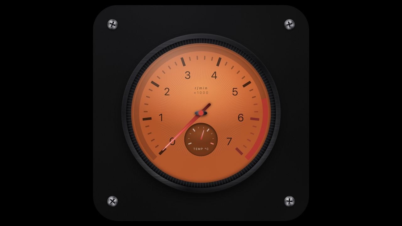
Four layered CSS instruments — tachometer, speedometer, turbo boost, and EV power — each isolated to one full-bleed dial with polar tick geometry, scale bands, and a self-testing needle sweep.
> 来源:ThreeUI Community · https://threeui.com · MIT License(Meng To / Design+Code)
> 组件页:https://threeui.com/component/performance-gauges · 预览动画:https://threeui.com/previews/performance-gauges.webm
> 分类:CSS
> 包含变体(4):tachometer、speedometer、boost、power
/* ===== src/shaders/neuform-isolated/sources/performance-gauges.html (html) ===== */
<!DOCTYPE html>
<html lang="en">
<head>
<meta charset="UTF-8">
<meta name="viewport" content="width=device-width, initial-scale=1.0">
<title>Performance Diagnostics</title>
<script src="https://cdn.tailwindcss.com"></script>
<script src="https://code.iconify.design/iconify-icon/1.0.7/iconify-icon.min.js"></script>
<style>
:root {
color-scheme: dark;
/* procedural noise fields, generated inline so the document stays self-contained.
fractal noise for print grain, anisotropic noise for brushed metal,
and a low-frequency field for smudge and dust on the cover glass. */
--tex-grain: url("data:image/svg+xml,%3Csvg xmlns='http://www.w3.org/2000/svg' width='180' height='180'%3E%3Cfilter id='g'%3E%3CfeTurbulence type='fractalNoise' baseFrequency='0.85' numOctaves='3' stitchTiles='stitch'/%3E%3CfeColorMatrix type='saturate' values='0'/%3E%3C/filter%3E%3Crect width='180' height='180' filter='url(%23g)'/%3E%3C/svg%3E");
--tex-metal: url("data:image/svg+xml,%3Csvg xmlns='http://www.w3.org/2000/svg' width='220' height='220'%3E%3Cfilter id='m'%3E%3CfeTurbulence type='fractalNoise' baseFrequency='0.008 1.5' numOctaves='4' stitchTiles='stitch'/%3E%3CfeColorMatrix type='saturate' values='0'/%3E%3C/filter%3E%3Crect width='220' height='220' filter='url(%23m)'/%3E%3C/svg%3E");
--tex-dust: url("data:image/svg+xml,%3Csvg xmlns='http://www.w3.org/2000/svg' width='300' height='300'%3E%3Cfilter id='d'%3E%3CfeTurbulence type='fractalNoise' baseFrequency='0.014' numOctaves='2' stitchTiles='stitch'/%3E%3CfeColorMatrix type='saturate' values='0'/%3E%3CfeComponentTransfer%3E%3CfeFuncA type='linear' slope='0.6'/%3E%3C/feComponentTransfer%3E%3C/filter%3E%3Crect width='300' height='300' filter='url(%23d)'/%3E%3C/svg%3E");
}
/* every dimension inside a gauge is expressed against the card width,
so one instrument reads identically at 300px and at 900px */
.gauge-card { container-type: inline-size; }
/* ---------- mounting plate ---------- */
.plate {
position: absolute;
inset: 0;
border-radius: 11.5cqw;
background: radial-gradient(120% 100% at 30% 0%, #121215 0%, #09090A 55%, #060607 100%);
border: 1px solid rgba(255,255,255,.03);
box-shadow:
0px 1px 1px -0.5px rgba(0,0,0,.5),
0px 3px 3px -1.5px rgba(0,0,0,.4),
0px 6px 6px -3px rgba(0,0,0,.35),
0px 12px 12px -6px rgba(0,0,0,.3),
0px 24px 24px -12px rgba(0,0,0,.25);
transition: border-color .5s;
}
/* fine anodised tooth so the plate is not a flat fill */
.plate::before {
content: "";
position: absolute;
inset: 0;
border-radius: inherit;
background-image: var(--tex-grain), var(--tex-dust);
background-size: 34cqw 34cqw, 170% 170%;
background-blend-mode: soft-light, normal;
mix-blend-mode: screen;
opacity: .07;
pointer-events: none;
}
.gauge-card:hover .plate { border-color: rgba(255,255,255,.08); }
/* ---------- instrument shell ---------- */
.shell {
position: absolute;
inset: 13cqw;
border-radius: 50%;
padding: 2.2%;
background:
var(--tex-metal),
conic-gradient(from 210deg, #3a3a3d 0deg, #17171a 60deg, #2c2c30 130deg, #0d0d0f 200deg, #313135 280deg, #131316 340deg, #3a3a3d 360deg);
background-size: 100% 100%, auto;
background-blend-mode: overlay, normal;
box-shadow:
0 18px 40px -12px rgba(0,0,0,.9),
0 2px 0 rgba(255,255,255,.05),
inset 0 2px 6px rgba(255,255,255,.10),
inset 0 -6px 14px rgba(0,0,0,.65);
}
.bezel {
position: relative;
width: 100%;
height: 100%;
border-radius: 50%;
padding: 3.4%;
background: radial-gradient(closest-side, #0b0b0d 76%, #212125 92%, #08080a 100%);
box-shadow: inset 0 1px 1px rgba(255,255,255,.10), inset 0 -3px 8px rgba(0,0,0,.8);
}
/* knurled grip ring milled into the bezel edge */
.bezel::before {
content: "";
position: absolute;
inset: 0;
border-radius: 50%;
background: repeating-conic-gradient(from 0deg, rgba(255,255,255,.16) 0deg 0.5deg, rgba(0,0,0,0) 0.5deg 2.2deg);
-webkit-mask-image: radial-gradient(closest-side, transparent 92%, #000 93.5%, #000 99%, transparent 100%);
mask-image: radial-gradient(closest-side, transparent 92%, #000 93.5%, #000 99%, transparent 100%);
opacity: .45;
pointer-events: none;
}
/* brushed tooling marks across the bezel ring */
.bezel::after {
content: "";
position: absolute;
inset: 0;
border-radius: 50%;
background-image: var(--tex-metal);
background-size: 100% 100%;
-webkit-mask-image: radial-gradient(closest-side, transparent 95%, #000 96.5%, #000 100%);
mask-image: radial-gradient(closest-side, transparent 95%, #000 96.5%, #000 100%);
mix-blend-mode: overlay;
opacity: .55;
pointer-events: none;
}
/* a turned stainless pan head sunk into a counterbored well */
.screw {
position: absolute;
width: 5cqw;
aspect-ratio: 1;
border-radius: 50%;
background:
radial-gradient(circle at 34% 26%, rgba(255,255,255,.55) 0%, rgba(255,255,255,.08) 26%, rgba(255,255,255,0) 46%),
radial-gradient(closest-side, rgba(0,0,0,0) 58%, rgba(0,0,0,.45) 84%, rgba(0,0,0,.7) 100%),
conic-gradient(from calc(var(--a, 0deg) - 52deg),
#9a9ba1 0deg, #43444a 34deg, #c3c4ca 74deg, #4d4e55 118deg,
#a7a8ae 168deg, #37383d 214deg, #b2b3b9 262deg, #45464c 312deg, #9a9ba1 360deg);
box-shadow:
0 0 0 .16cqw rgba(0,0,0,.6),
0 .12cqw 0 .16cqw rgba(255,255,255,.05),
0 .3cqw .6cqw rgba(0,0,0,.75),
inset 0 -.16cqw .32cqw rgba(0,0,0,.6),
inset 0 .12cqw .24cqw rgba(255,255,255,.4);
}
/* cross drive: dark recess with a lit lower lip so it reads as cut, not printed */
.screw::before {
content: "";
position: absolute;
inset: 22%;
transform: rotate(var(--a, 0deg));
background:
linear-gradient(#050506, #1e1e23) center / 100% 20% no-repeat,
linear-gradient(#050506, #1e1e23) center / 20% 100% no-repeat,
linear-gradient(rgba(255,255,255,.62), rgba(255,255,255,.62)) center calc(50% + .11cqw) / 100% 20% no-repeat,
linear-gradient(rgba(255,255,255,.62), rgba(255,255,255,.62)) calc(50% + .11cqw) center / 20% 100% no-repeat;
}
/* turning marks on the head */
.screw::after {
content: "";
position: absolute;
inset: 0;
border-radius: 50%;
background-image: var(--tex-metal);
background-size: 100% 100%;
mix-blend-mode: overlay;
opacity: .45;
}
/* ---------- dial face ---------- */
.face {
container-type: inline-size;
position: relative;
width: 100%;
height: 100%;
border-radius: 50%;
overflow: hidden;
box-shadow: inset 0 5px 16px rgba(0,0,0,.5), inset 0 -2px 9px rgba(0,0,0,.4);
}
.layer { position: absolute; inset: 0; pointer-events: none; }
/* a full-bleed square rotated about its centre carries its child around the dial */
.spoke { position: absolute; inset: 0; }
.tick {
position: absolute;
left: 50%;
transform: translateX(-50%);
border-radius: 1px;
}
.tick.minor { top: 9%; width: 0.9%; height: 2.8%; opacity: .5; }
.tick.major { top: 8%; width: 1.8%; height: 6.4%; }
.numeral {
position: absolute;
left: 50%;
top: 17.5%;
line-height: 1;
white-space: nowrap;
font-variant-numeric: tabular-nums;
}
/* ---------- needle ---------- */
.needle {
position: absolute;
inset: 0;
transform: rotate(var(--angle, 0deg));
transition: transform var(--needle-duration, 1200ms) var(--needle-ease, cubic-bezier(.2,.9,.25,1));
will-change: transform;
}
.flutter { position: absolute; inset: 0; }
.blade {
position: absolute;
left: 50%;
top: 11.5%;
bottom: 50%;
width: 3.2%;
transform: translateX(-50%);
clip-path: polygon(41% 0, 59% 0, 100% 97%, 100% 100%, 0 100%, 0 97%);
filter: drop-shadow(0 3px 6px rgba(0,0,0,.55));
}
.blade::after {
content: "";
position: absolute;
inset: 7% 40% 20% 40%;
border-radius: 999px;
background: linear-gradient(rgba(255,255,255,.34), rgba(255,255,255,0));
}
.tail {
position: absolute;
left: 50%;
top: 50%;
width: 2%;
height: 9.5%;
transform: translateX(-50%);
border-radius: 0 0 999px 999px;
filter: drop-shadow(0 2px 4px rgba(0,0,0,.5));
}
.hub {
position: absolute;
left: 50%;
top: 50%;
transform: translate(-50%, -50%);
border-radius: 50%;
background: radial-gradient(circle at 34% 30%, #5c5c63, #1b1b1f 60%, #050506);
box-shadow: 0 3px 8px rgba(0,0,0,.75), inset 0 1px 2px rgba(255,255,255,.35);
display: grid;
place-items: center;
}
/* ---------- glass ---------- */
.glass {
position: absolute;
inset: 0;
border-radius: 50%;
background:
radial-gradient(120% 78% at 22% 6%, rgba(255,255,255,.20) 0%, rgba(255,255,255,.05) 32%, rgba(255,255,255,0) 56%),
linear-gradient(148deg, rgba(255,255,255,.12) 0%, rgba(255,255,255,0) 40%);
mix-blend-mode: screen;
pointer-events: none;
}
.glass::after {
content: "";
position: absolute;
inset: 0;
border-radius: 50%;
box-shadow: inset 0 0 20px rgba(0,0,0,.5), inset 0 1px 1px rgba(255,255,255,.2);
}
/* smudge and settled dust caught by the raking highlight */
.glass-dust {
position: absolute;
inset: 0;
border-radius: 50%;
background-image: var(--tex-dust), var(--tex-grain);
background-size: 130% 130%, 30.03cqw 30.03cqw;
mix-blend-mode: soft-light;
opacity: .3;
pointer-events: none;
}
/* printed-dial tooth, held under the ticks and numerals */
.face-grain {
position: absolute;
inset: 0;
background-image: var(--tex-grain);
background-size: 25.4cqw 25.4cqw;
mix-blend-mode: overlay;
opacity: .13;
pointer-events: none;
}
/* ---------- centre stack typography ---------- */
.stack { position: absolute; left: 50%; transform: translateX(-50%); display: flex; flex-direction: column; align-items: center; }
.cap { font-size: 2.89cqw; letter-spacing: .42em; text-indent: .42em; line-height: 1; }
.cap-sm { font-size: 2.43cqw; letter-spacing: .3em; text-indent: .3em; line-height: 1; }
.readout { font-size: 8.55cqw; font-weight: 300; line-height: 1; font-variant-numeric: tabular-nums; }
/* ---------- motion ---------- */
@keyframes flutter { 0%, 100% { transform: rotate(-.4deg); } 50% { transform: rotate(.4deg); } }
.flutter[data-live] { animation: flutter 2.6s ease-in-out infinite; }
@keyframes pulse-soft { 0%, 100% { opacity: .35; } 50% { opacity: 1; } }
.pulse { animation: pulse-soft 1.4s ease-in-out infinite; }
@media (prefers-reduced-motion: reduce) {
.needle, [data-peak], [data-soc] { transition: none !important; }
.flutter[data-live], .pulse { animation: none !important; }
[data-anim] { transition: none !important; }
}
</style>
</head>
<body class="bg-black min-h-screen text-white font-sans flex flex-col items-center justify-center p-6 sm:p-12 selection:bg-[#E26226] selection:text-white">
<!-- Header Section -->
<div data-anim="true" class="max-w-4xl w-full mb-16 text-center" style="opacity: 0; transform: translateY(20px); filter: blur(4px); transition: all 0.8s cubic-bezier(0.2, 0.8, 0.2, 1);">
<h1 class="text-3xl sm:text-5xl font-extralight tracking-tight mb-4 text-white/90" id="hero-title">
Performance Diagnostics
</h1>
<p class="text-white/40 text-sm sm:text-base max-w-xl mx-auto font-extralight" id="hero-subtitle">
Advanced tracking interfaces engineered for extreme conditions. Analyze vital statistics instantly with unmatched precision.
</p>
</div>
<!-- Dashboard Container -->
<div class="grid grid-cols-1 md:grid-cols-2 gap-8 sm:gap-12 w-full max-w-5xl justify-items-center">
<!-- Card 1: Tachometer -->
<div id="gauge-tachometer" data-anim="true" data-gauge="tachometer" class="gauge-card w-full max-w-[340px] aspect-square relative group" style="opacity: 0; transform: translateY(20px); filter: blur(4px); transition: all 0.8s cubic-bezier(0.2, 0.8, 0.2, 1); transition-delay: 100ms;">
<div class="plate">
<span class="screw" style="--a:26deg;top:6.4cqw;left:6.4cqw"></span>
<span class="screw" style="--a:-15deg;top:6.4cqw;right:6.4cqw"></span>
<span class="screw" style="--a:42deg;bottom:6.4cqw;left:6.4cqw"></span>
<span class="screw" style="--a:7deg;bottom:6.4cqw;right:6.4cqw"></span>
<div class="shell">
<div class="bezel">
<div class="face" style="background: radial-gradient(closest-side at 50% 32%, #F58135 0%, #E76A2A 44%, #D0541B 74%, #B94512 100%);">
<!-- machined sunburst -->
<div class="layer" style="background: repeating-conic-gradient(from 0deg, rgba(255,255,255,.055) 0deg 1.2deg, rgba(0,0,0,.05) 1.2deg 2.4deg); -webkit-mask-image: radial-gradient(closest-side, #000 0%, #000 58%, transparent 66%); mask-image: radial-gradient(closest-side, #000 0%, #000 58%, transparent 66%); opacity:.6;"></div>
<!-- scale band with redline -->
<div class="layer" data-zone-band style="-webkit-mask-image: radial-gradient(closest-side, transparent 88%, #000 89%, #000 95.5%, transparent 96.5%); mask-image: radial-gradient(closest-side, transparent 88%, #000 89%, #000 95.5%, transparent 96.5%);"></div>
<div class="layer" data-ticks></div>
<div class="layer" data-numerals></div>
<div class="stack" style="top:31%">
<span class="cap-sm text-black/55 font-medium">r/min</span>
<span class="cap-sm text-black/40" style="margin-top:0.81cqw">×1000</span>
</div>
<!-- oil-temperature sub-dial -->
<div class="absolute left-1/2 top-[69%] -translate-x-1/2 -translate-y-1/2 w-[24%] aspect-square rounded-full overflow-hidden border border-black/45 shadow-[inset_0_3px_8px_rgba(0,0,0,.55)]" style="background: radial-gradient(closest-side at 50% 30%, #8C3A11, #6E2A08);">
<div class="layer" data-subticks></div>
<span class="absolute left-1/2 bottom-[15%] -translate-x-1/2 text-white/55 whitespace-nowrap" style="font-size:1.96cqw;letter-spacing:.2em;text-indent:.2em">TEMP °C</span>
<div class="needle" data-subneedle style="--needle-duration:1700ms">
<i class="blade" style="top:19%;width:5.5%;background:linear-gradient(#FCA5A5,#B91C1C)"></i>
</div>
<div class="hub" style="width:15%"></div>
</div>
<div class="needle" data-needle style="--needle-ease:cubic-bezier(.16,1.28,.4,1)">
<div class="flutter">
<i class="blade" style="background:linear-gradient(#F87171,#DC2626 50%,#991B1B)"></i>
<i class="tail" style="background:linear-gradient(#7F1D1D,#450A0A)"></i>
</div>
</div>
<div class="hub" style="width:9%">
<span class="block w-[40%] aspect-square rounded-full bg-[#DC2626] shadow-[0_0_6px_rgba(220,38,38,.85)]"></span>
</div>
<div class="face-grain"></div>
<div class="glass"></div>
<div class="glass-dust"></div>
</div>
</div>
</div>
</div>
</div>
<!-- Card 2: Speedometer -->
<div id="gauge-speedometer" data-anim="true" data-gauge="speedometer" class="gauge-card w-full max-w-[340px] aspect-square relative group" style="opacity: 0; transform: translateY(20px); filter: blur(4px); transition: all 0.8s cubic-bezier(0.2, 0.8, 0.2, 1); transition-delay: 300ms;">
<div class="plate">
<span class="screw" style="--a:-33deg;top:6.4cqw;left:6.4cqw"></span>
<span class="screw" style="--a:18deg;top:6.4cqw;right:6.4cqw"></span>
<span class="screw" style="--a:5deg;bottom:6.4cqw;left:6.4cqw"></span>
<span class="screw" style="--a:-48deg;bottom:6.4cqw;right:6.4cqw"></span>
<div class="shell">
<div class="bezel">
<div class="face" style="background: radial-gradient(closest-side at 50% 28%, #1d1d21 0%, #141416 50%, #0a0a0b 100%);">
<!-- filled travel: a soft inner wash plus a bright rim arc -->
<div class="layer" data-progress-wash style="-webkit-mask-image: radial-gradient(closest-side, transparent 66%, #000 80%, #000 86%, transparent 89%); mask-image: radial-gradient(closest-side, transparent 66%, #000 80%, #000 86%, transparent 89%); opacity:.11;"></div>
<div class="layer" data-zone-band style="-webkit-mask-image: radial-gradient(closest-side, transparent 88%, #000 89%, #000 95.5%, transparent 96.5%); mask-image: radial-gradient(closest-side, transparent 88%, #000 89%, #000 95.5%, transparent 96.5%);"></div>
<div class="layer" data-progress-arc style="-webkit-mask-image: radial-gradient(closest-side, transparent 88%, #000 89%, #000 95.5%, transparent 96.5%); mask-image: radial-gradient(closest-side, transparent 88%, #000 89%, #000 95.5%, transparent 96.5%);"></div>
<div class="layer" data-ticks></div>
<div class="layer" data-numerals></div>
<!-- peak-hold marker -->
<div class="spoke" data-peak style="transition: transform 900ms cubic-bezier(.2,.9,.25,1)">
<i class="absolute left-1/2 top-[7.4%] -translate-x-1/2 w-[1.3%] h-[4%] bg-white/85 rounded-[1px] shadow-[0_0_7px_rgba(255,255,255,.7)]"></i>
</div>
<div class="stack" style="top:29%">
<iconify-icon icon="solar:shield-star-linear" class="text-white/25" style="font-size:6.24cqw"></iconify-icon>
<span class="cap-sm text-white/30" style="margin-top:1.39cqw">km/h</span>
</div>
<div class="stack" style="top:58%">
<span data-readout class="readout text-[#E26226]" style="text-shadow:0 0 12px rgba(226,98,38,.45)">0</span>
</div>
<!-- odometer -->
<div class="stack items-center" style="top:77%">
<div class="bg-black/85 border border-white/10 rounded shadow-[inset_0_1px_3px_rgba(0,0,0,.9)] flex flex-col items-center" style="padding:0.92cqw 1.85cqw">
<div class="text-[#E26226] font-mono flex items-center" style="font-size:3.93cqw;letter-spacing:.14em;gap:0.58cqw">
<span>3</span><span>1</span><span>5</span><span>9</span><span class="bg-[#E26226] text-black rounded-[2px]" style="padding:0 0.81cqw">5</span>
</div>
<span class="text-white/30 uppercase" style="font-size:2.08cqw;letter-spacing:.28em;margin-top:0.81cqw">km total</span>
</div>
</div>
<div class="needle" data-needle style="--needle-ease:cubic-bezier(.16,1.28,.4,1)">
<div class="flutter">
<i class="blade" style="background:linear-gradient(#6EE7A0,#22C55E 50%,#15803D); filter: drop-shadow(0 0 7px rgba(74,222,128,.6))"></i>
<i class="tail" style="background:linear-gradient(#166534,#052E16)"></i>
</div>
</div>
<div class="hub" style="width:8.5%">
<span class="block w-[38%] aspect-square rounded-full bg-[#4ADE80]/85 shadow-[0_0_6px_rgba(74,222,128,.75)]"></span>
</div>
<div class="face-grain"></div>
<div class="glass"></div>
<div class="glass-dust"></div>
</div>
</div>
</div>
</div>
</div>
<!-- Card 3: Turbo Boost -->
<div id="gauge-boost" data-anim="true" data-gauge="boost" class="gauge-card w-full max-w-[340px] aspect-square relative group" style="opacity: 0; transform: translateY(20px); filter: blur(4px); transition: all 0.8s cubic-bezier(0.2, 0.8, 0.2, 1); transition-delay: 500ms;">
<div class="plate">
<span class="screw" style="--a:12deg;top:6.4cqw;left:6.4cqw"></span>
<span class="screw" style="--a:-40deg;top:6.4cqw;right:6.4cqw"></span>
<span class="screw" style="--a:29deg;bottom:6.4cqw;left:6.4cqw"></span>
<span class="screw" style="--a:-6deg;bottom:6.4cqw;right:6.4cqw"></span>
<div class="shell">
<div class="bezel">
<div class="face" style="background: radial-gradient(closest-side at 50% 26%, #17324F 0%, #0F172A 48%, #030816 100%);">
<div class="layer" style="background: repeating-conic-gradient(from 0deg, rgba(56,189,248,.06) 0deg 1.4deg, rgba(0,0,0,0) 1.4deg 2.8deg); -webkit-mask-image: radial-gradient(closest-side, #000 0%, #000 56%, transparent 64%); mask-image: radial-gradient(closest-side, #000 0%, #000 56%, transparent 64%);"></div>
<div class="layer" data-zone-band style="-webkit-mask-image: radial-gradient(closest-side, transparent 88%, #000 89%, #000 95.5%, transparent 96.5%); mask-image: radial-gradient(closest-side, transparent 88%, #000 89%, #000 95.5%, transparent 96.5%);"></div>
<div class="layer" data-ticks></div>
<div class="layer" data-numerals></div>
<div class="stack" style="top:30%">
<iconify-icon icon="solar:wind-linear" class="text-cyan-400/80" style="font-size:6.47cqw"></iconify-icon>
<span class="cap text-white/45" style="margin-top:1.62cqw">BOOST</span>
</div>
<div class="stack" style="top:57%">
<span data-readout class="readout text-cyan-300" style="text-shadow:0 0 12px rgba(34,211,238,.5)">0.00</span>
<span class="cap text-cyan-500/70" style="margin-top:1.85cqw">BAR</span>
</div>
<div class="stack" style="top:79%">
<div class="flex items-center text-white/35" style="gap:1.62cqw;font-size:2.19cqw;letter-spacing:.26em">
<span class="rounded-full bg-red-500 pulse" style="width:1.85cqw;height:1.85cqw" data-overboost hidden></span>
<span>WASTEGATE 1.20</span>
</div>
</div>
<div class="needle" data-needle style="--needle-ease:cubic-bezier(.16,1.32,.4,1)">
<div class="flutter">
<i class="blade" style="background:linear-gradient(#4DD9F0,#0EB8D7 50%,#0E7490); filter: drop-shadow(0 0 8px rgba(34,211,238,.65))"></i>
<i class="tail" style="background:linear-gradient(#155E75,#083344)"></i>
</div>
</div>
<div class="hub" style="width:9%">
<span class="block w-[38%] aspect-square rounded-full bg-cyan-400/85 shadow-[0_0_6px_rgba(34,211,238,.85)]"></span>
</div>
<div class="face-grain"></div>
<div class="glass"></div>
<div class="glass-dust"></div>
</div>
</div>
</div>
</div>
</div>
<!-- Card 4: EV Power / Charge -->
<div id="gauge-power" data-anim="true" data-gauge="power" class="gauge-card w-full max-w-[340px] aspect-square relative group" style="opacity: 0; transform: translateY(20px); filter: blur(4px); transition: all 0.8s cubic-bezier(0.2, 0.8, 0.2, 1); transition-delay: 700ms;">
<div class="plate">
<span class="screw" style="--a:47deg;top:6.4cqw;left:6.4cqw"></span>
<span class="screw" style="--a:3deg;top:6.4cqw;right:6.4cqw"></span>
<span class="screw" style="--a:-21deg;bottom:6.4cqw;left:6.4cqw"></span>
<span class="screw" style="--a:35deg;bottom:6.4cqw;right:6.4cqw"></span>
<div class="shell">
<div class="bezel">
<div class="face" style="background: radial-gradient(closest-side at 50% 28%, #191624 0%, #111016 50%, #08070B 100%);">
<div class="layer" data-zone-band style="-webkit-mask-image: radial-gradient(closest-side, transparent 88%, #000 89%, #000 95.5%, transparent 96.5%); mask-image: radial-gradient(closest-side, transparent 88%, #000 89%, #000 95.5%, transparent 96.5%);"></div>
<div class="layer" data-progress-arc style="-webkit-mask-image: radial-gradient(closest-side, transparent 88%, #000 89%, #000 95.5%, transparent 96.5%); mask-image: radial-gradient(closest-side, transparent 88%, #000 89%, #000 95.5%, transparent 96.5%);"></div>
<div class="layer" data-ticks></div>
<div class="layer" data-numerals></div>
<div class="stack" style="top:29%">
<iconify-icon icon="solar:bolt-linear" class="text-purple-400/90" style="font-size:6.47cqw"></iconify-icon>
<span class="cap text-white/45" style="margin-top:1.62cqw">POWER</span>
</div>
<div class="stack" style="top:57%">
<span data-readout class="readout text-purple-200" style="text-shadow:0 0 12px rgba(192,132,252,.45)">0</span>
<span class="cap text-purple-400/70" style="margin-top:1.85cqw">KW</span>
</div>
<!-- battery state of charge -->
<div class="stack" style="top:76%">
<div class="rounded-full bg-white/10 overflow-hidden border border-white/10" style="width:23.1cqw;height:1.96cqw">
<div data-soc class="h-full rounded-full bg-gradient-to-r from-emerald-400 to-emerald-300 transition-[width] duration-[1400ms] ease-out" style="width:0%"></div>
</div>
<span class="text-white/35" style="font-size:2.19cqw;letter-spacing:.28em;margin-top:1.39cqw">SOC 72%</span>
</div>
<div class="needle" data-needle style="--needle-ease:cubic-bezier(.16,1.28,.4,1)">
<div class="flutter">
<i class="blade" style="background:linear-gradient(#C88CFA,#9333EA 50%,#6B21A8); filter: drop-shadow(0 0 8px rgba(168,85,247,.6))"></i>
<i class="tail" style="background:linear-gradient(#581C87,#2E1065)"></i>
</div>
</div>
<div class="hub" style="width:9%">
<span class="block w-[38%] aspect-square rounded-full bg-purple-400/85 shadow-[0_0_6px_rgba(168,85,247,.85)]"></span>
</div>
<div class="face-grain"></div>
<div class="glass"></div>
<div class="glass-dust"></div>
</div>
</div>
</div>
</div>
</div>
</div>
<!-- Script for dial construction, reveal, and instrument motion -->
<script>
document.addEventListener('DOMContentLoaded', () => {
const reduceMotion = window.matchMedia && window.matchMedia('(prefers-reduced-motion: reduce)').matches;
/* ---------- dial specifications ---------- */
const SPECS = {
tachometer: {
start: -135, sweep: 270, min: 0, max: 7,
majorStep: 1, minorPerMajor: 5,
numeral: (v) => String(v),
numeralStyle: 'font-size:7.39cqw;font-weight:300;color:rgba(0,0,0,.78)',
tickColor: (v) => (v >= 5.5 ? '#7F1D1D' : 'rgba(0,0,0,.7)'),
zones: [
{ from: 0, to: 5.5, color: 'rgba(0,0,0,.22)' },
{ from: 5.5, to: 7, color: 'rgba(185,28,28,.95)' },
],
idle: 0, value: 5.2,
sub: { start: -110, sweep: 220, min: 40, max: 130, majorStep: 30, minorPerMajor: 3, value: 92 },
},
speedometer: {
start: -135, sweep: 270, min: 0, max: 160,
majorStep: 20, minorPerMajor: 4,
numeral: (v) => String(v),
numeralStyle: 'font-size:5.31cqw;font-weight:300;color:rgba(255,255,255,.72)',
tickColor: (v) => (v >= 140 ? 'rgba(248,113,113,.95)' : 'rgba(255,255,255,.6)'),
zones: [
{ from: 0, to: 140, color: 'rgba(255,255,255,.09)' },
{ from: 140, to: 160, color: 'rgba(220,38,38,.6)' },
],
progress: '#E26226', wash: '#E26226',
idle: 0, value: 118, peak: 143,
readout: (v) => String(Math.round(v)),
},
boost: {
start: -135, sweep: 270, min: -1, max: 1.5,
majorStep: 0.5, minorPerMajor: 5,
numeral: (v) => v.toFixed(1),
numeralStyle: 'font-size:4.85cqw;font-weight:300;color:rgba(255,255,255,.7)',
tickColor: (v) => (v >= 1.2 ? 'rgba(248,113,113,.95)' : v < 0 ? 'rgba(148,163,184,.65)' : 'rgba(103,232,249,.85)'),
zones: [
{ from: -1, to: 0, color: 'rgba(148,163,184,.55)' },
{ from: 0, to: 1.2, color: 'rgba(34,211,238,.6)' },
{ from: 1.2, to: 1.5, color: 'rgba(220,38,38,.9)' },
],
idle: -0.85, value: 0.92,
readout: (v) => (v >= 0 ? '+' : '−') + Math.abs(v).toFixed(2),
},
power: {
start: -135, sweep: 270, min: -30, max: 120,
majorStep: 30, minorPerMajor: 3,
numeral: (v) => (v === -30 ? 'CHG' : String(v)),
numeralStyle: 'font-size:4.85cqw;font-weight:300;color:rgba(255,255,255,.68)',
tickColor: (v) => (v < 0 ? 'rgba(52,211,153,.85)' : 'rgba(216,180,254,.75)'),
zones: [
{ from: -30, to: 0, color: 'rgba(16,185,129,.7)' },
{ from: 0, to: 120, color: 'rgba(168,85,247,.3)' },
],
progress: '#C084FC', progressFrom: 0,
idle: -22, value: 78, soc: 72,
readout: (v) => String(Math.round(v)),
},
};
/* ---------- polar helpers ---------- */
const angleFor = (spec, value) => spec.start + ((value - spec.min) / (spec.max - spec.min)) * spec.sweep;
const spoke = (angle) => {
const wrap = document.createElement('div');
wrap.className = 'spoke';
wrap.style.transform = `rotate(${angle}deg)`;
return wrap;
};
const arcGradient = (spec, segments) => segments.map((segment) => {
const from = angleFor(spec, segment.from);
const span = ((segment.to - segment.from) / (spec.max - spec.min)) * spec.sweep;
return `conic-gradient(from ${from}deg, ${segment.color} 0deg, ${segment.color} ${span}deg, transparent ${span}deg)`;
}).join(', ');
function buildTicks(host, spec, options) {
if (!host) return;
const settings = options || {};
const step = spec.majorStep / spec.minorPerMajor;
const count = Math.round((spec.max - spec.min) / step);
for (let index = 0; index <= count; index += 1) {
const value = spec.min + index * step;
const isMajor = index % spec.minorPerMajor === 0;
const wrap = spoke(angleFor(spec, value));
const tick = document.createElement('i');
tick.className = `tick ${isMajor ? 'major' : 'minor'}`;
tick.style.background = (settings.color || spec.tickColor)(value);
if (settings.scale) {
tick.style.top = isMajor ? '9%' : '10.5%';
tick.style.height = isMajor ? '10%' : '5%';
tick.style.width = isMajor ? '3.6%' : '2.2%';
}
wrap.appendChild(tick);
host.appendChild(wrap);
}
}
function buildNumerals(host, spec) {
if (!host) return;
const count = Math.round((spec.max - spec.min) / spec.majorStep);
for (let index = 0; index <= count; index += 1) {
const value = Math.round((spec.min + index * spec.majorStep) * 1000) / 1000;
const angle = angleFor(spec, value);
const wrap = spoke(angle);
const numeral = document.createElement('span');
numeral.className = 'numeral';
numeral.setAttribute('style', spec.numeralStyle);
numeral.textContent = spec.numeral(value);
numeral.style.transform = `translateX(-50%) rotate(${-angle}deg)`;
wrap.appendChild(numeral);
host.appendChild(wrap);
}
}
/* ---------- build every dial ---------- */
document.querySelectorAll('[data-gauge]').forEach((card) => {
const spec = SPECS[card.dataset.gauge];
if (!spec) return;
buildTicks(card.querySelector('[data-ticks]'), spec);
buildNumerals(card.querySelector('[data-numerals]'), spec);
const band = card.querySelector('[data-zone-band]');
if (band && spec.zones) band.style.background = arcGradient(spec, spec.zones);
if (spec.sub) {
buildTicks(card.querySelector('[data-subticks]'), spec.sub, {
scale: true,
color: (value) => (value >= 115 ? 'rgba(248,113,113,.95)' : 'rgba(255,255,255,.55)'),
});
const subNeedle = card.querySelector('[data-subneedle]');
if (subNeedle) subNeedle.style.setProperty('--angle', `${angleFor(spec.sub, spec.sub.min)}deg`);
}
const needle = card.querySelector('[data-needle]');
if (needle) needle.style.setProperty('--angle', `${angleFor(spec, spec.idle)}deg`);
});
/* ---------- instrument sequence ---------- */
function setArc(card, selector, spec, value, color) {
const arc = card.querySelector(selector);
if (!arc || !color) return;
const from = spec.progressFrom != null ? spec.progressFrom : spec.min;
arc.style.background = arcGradient(spec, [{ from, to: Math.max(from, value), color }]);
}
function countTo(element, spec, from, to, duration) {
if (!element || !spec.readout) return;
if (reduceMotion || duration === 0) { element.textContent = spec.readout(to); return; }
const started = performance.now();
const step = (now) => {
const progress = Math.min(1, (now - started) / duration);
const eased = 1 - Math.pow(1 - progress, 3);
element.textContent = spec.readout(from + (to - from) * eased);
if (progress < 1) requestAnimationFrame(step);
};
requestAnimationFrame(step);
}
function sweepTo(card, spec, value, duration) {
const needle = card.querySelector('[data-needle]');
if (needle) {
needle.style.setProperty('--needle-duration', `${duration}ms`);
needle.style.setProperty('--angle', `${angleFor(spec, value)}deg`);
}
setArc(card, '[data-progress-arc]', spec, value, spec.progress);
setArc(card, '[data-progress-wash]', spec, value, spec.wash);
const overboost = card.querySelector('[data-overboost]');
if (overboost) overboost.hidden = value < 1.2;
}
function runInstrument(card) {
const spec = SPECS[card.dataset.gauge];
if (!spec) return;
const readout = card.querySelector('[data-readout]');
const flutter = card.querySelector('[data-needle] .flutter');
const peak = card.querySelector('[data-peak]');
const soc = card.querySelector('[data-soc]');
const subNeedle = card.querySelector('[data-subneedle]');
const peakTo = (value) => { if (peak && spec.peak != null) peak.style.transform = `rotate(${angleFor(spec, value)}deg)`; };
if (soc && spec.soc != null) soc.style.width = `${spec.soc}%`;
if (subNeedle && spec.sub) subNeedle.style.setProperty('--angle', `${angleFor(spec.sub, spec.sub.value)}deg`);
if (reduceMotion) {
sweepTo(card, spec, spec.value, 0);
countTo(readout, spec, spec.value, spec.value, 0);
peakTo(spec.peak);
return;
}
const cycle = () => {
if (flutter) flutter.removeAttribute('data-live');
/* instrument self-test: full-scale sweep, fall back to rest, settle on the live reading */
sweepTo(card, spec, spec.max, 1100);
countTo(readout, spec, spec.idle, spec.max, 1100);
peakTo(spec.max);
setTimeout(() => {
sweepTo(card, spec, spec.idle, 900);
countTo(readout, spec, spec.max, spec.idle, 900);
peakTo(spec.idle);
}, 1350);
setTimeout(() => {
sweepTo(card, spec, spec.value, 1200);
countTo(readout, spec, spec.idle, spec.value, 1200);
peakTo(spec.peak);
}, 2500);
setTimeout(() => { if (flutter) flutter.setAttribute('data-live', ''); }, 3900);
};
cycle();
setInterval(cycle, 8000);
}
/* ---------- heading word reveal ---------- */
const wrapWords = (elementId) => {
const el = document.getElementById(elementId);
if (!el) return;
const text = el.innerText.trim().replace(/s+/g, ' ');
el.innerHTML = '';
const words = text.split(' ');
words.forEach((word, index) => {
const wordWrap = document.createElement('span');
wordWrap.style.display = 'inline-block';
wordWrap.style.overflow = 'hidden';
wordWrap.style.paddingBottom = '4px';
const wordSpan = document.createElement('span');
wordSpan.className = 'word';
wordSpan.style.display = 'inline-block';
wordSpan.style.opacity = '0';
wordSpan.style.transform = 'translateY(100%)';
wordSpan.style.filter = 'blur(4px)';
wordSpan.style.transition = 'all 0.6s cubic-bezier(0.2, 0.8, 0.2, 1)';
wordSpan.style.transitionDelay = `${index * 40}ms`;
wordSpan.innerHTML = word + ' ';
wordWrap.appendChild(wordSpan);
el.appendChild(wordWrap);
});
};
wrapWords('hero-title');
wrapWords('hero-subtitle');
const observer = new IntersectionObserver((entries, self) => {
entries.forEach((entry) => {
if (!entry.isIntersecting) return;
entry.target.style.opacity = '1';
entry.target.style.transform = 'translateY(0)';
entry.target.style.filter = 'blur(0)';
entry.target.querySelectorAll('.word').forEach((word) => {
word.style.opacity = '1';
word.style.transform = 'translateY(0)';
word.style.filter = 'blur(0)';
});
if (entry.target.dataset.gauge) setTimeout(() => runInstrument(entry.target), 500);
self.unobserve(entry.target);
});
}, { root: null, rootMargin: '0px', threshold: 0.1 });
document.querySelectorAll('[data-anim="true"]').forEach((el) => observer.observe(el));
});
</script>
</body>
</html>